ANA REZENDE | psychologist
BRAND DESGIN | GRAPHIC DESIGN
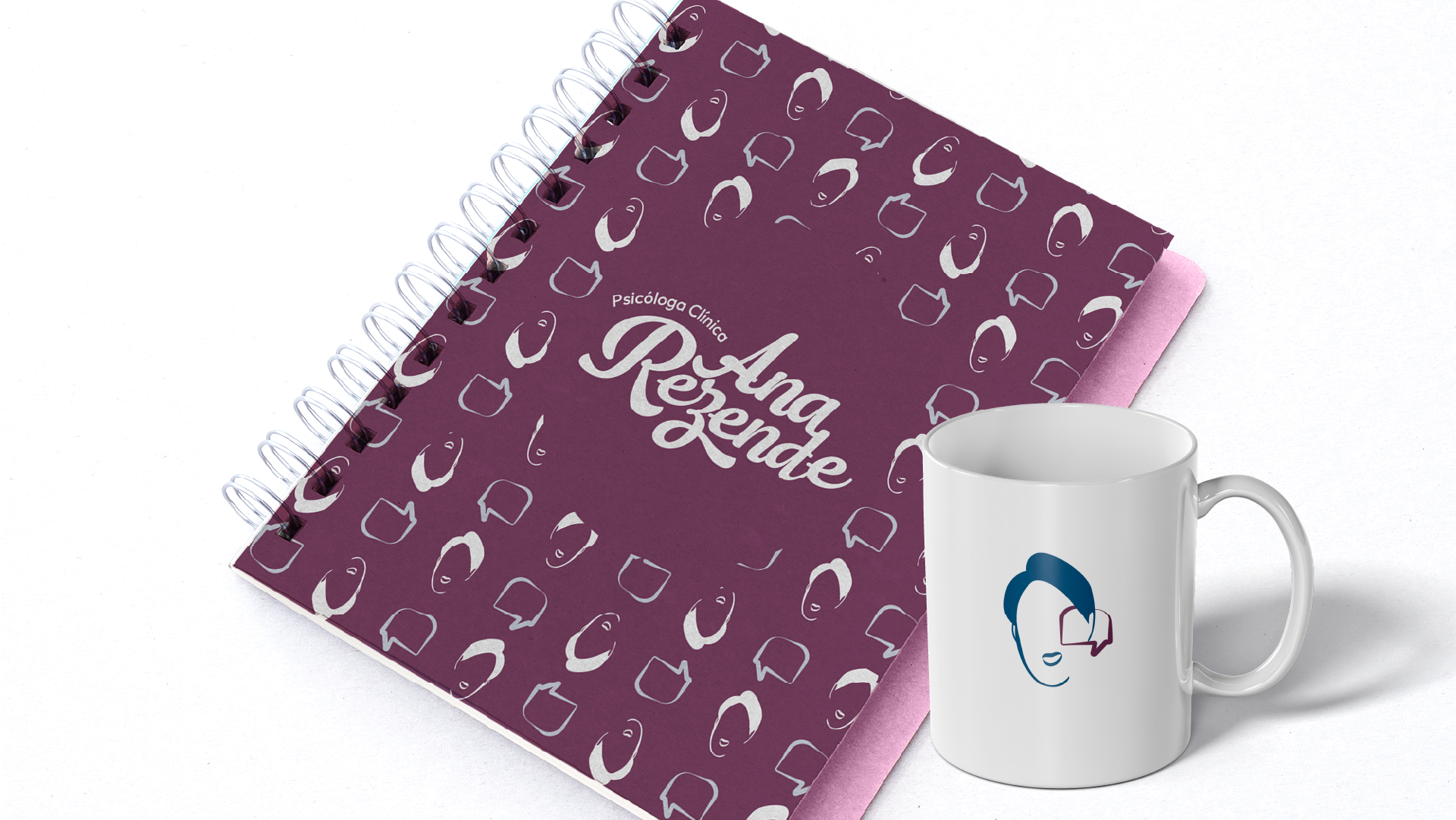
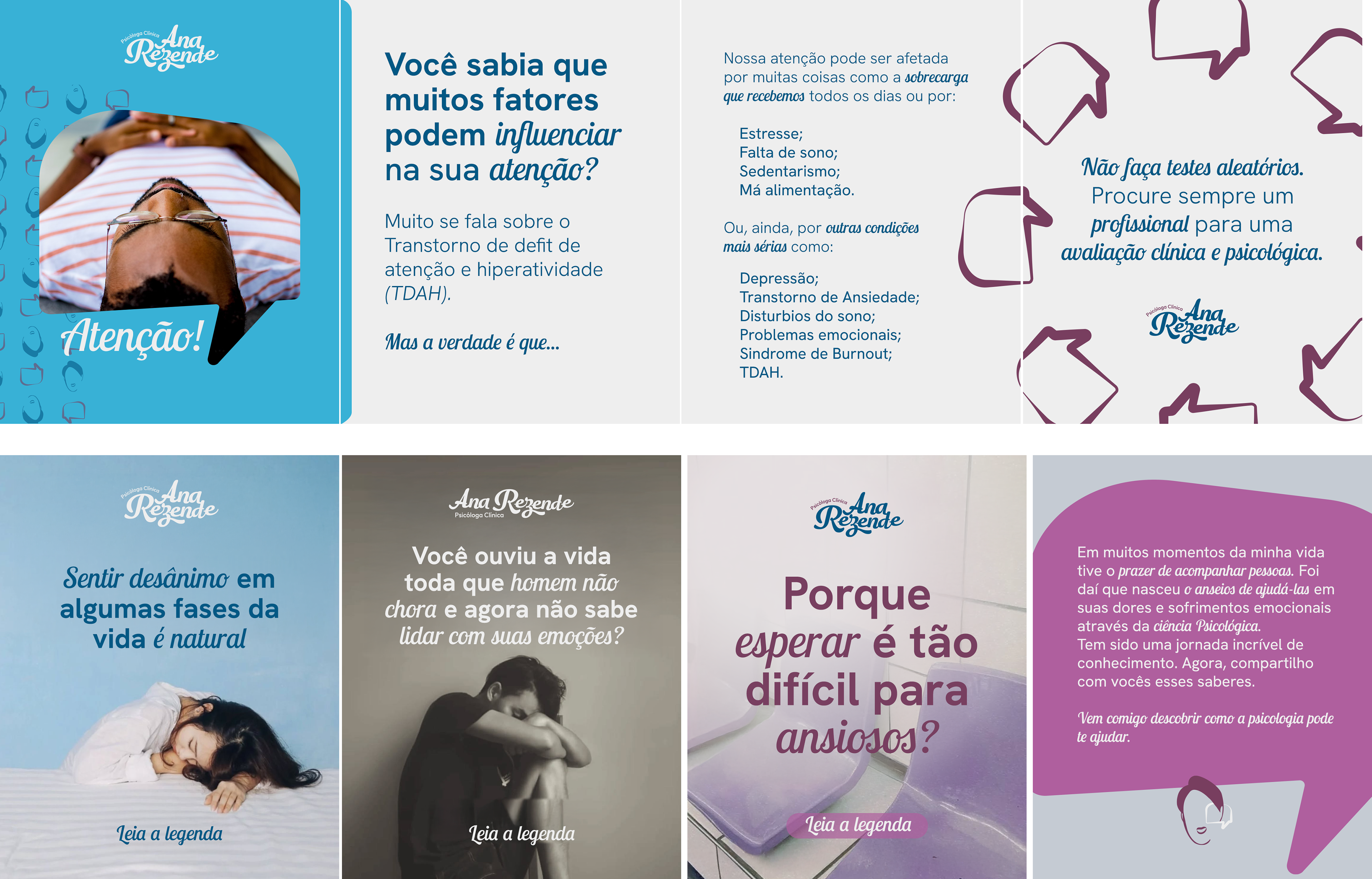
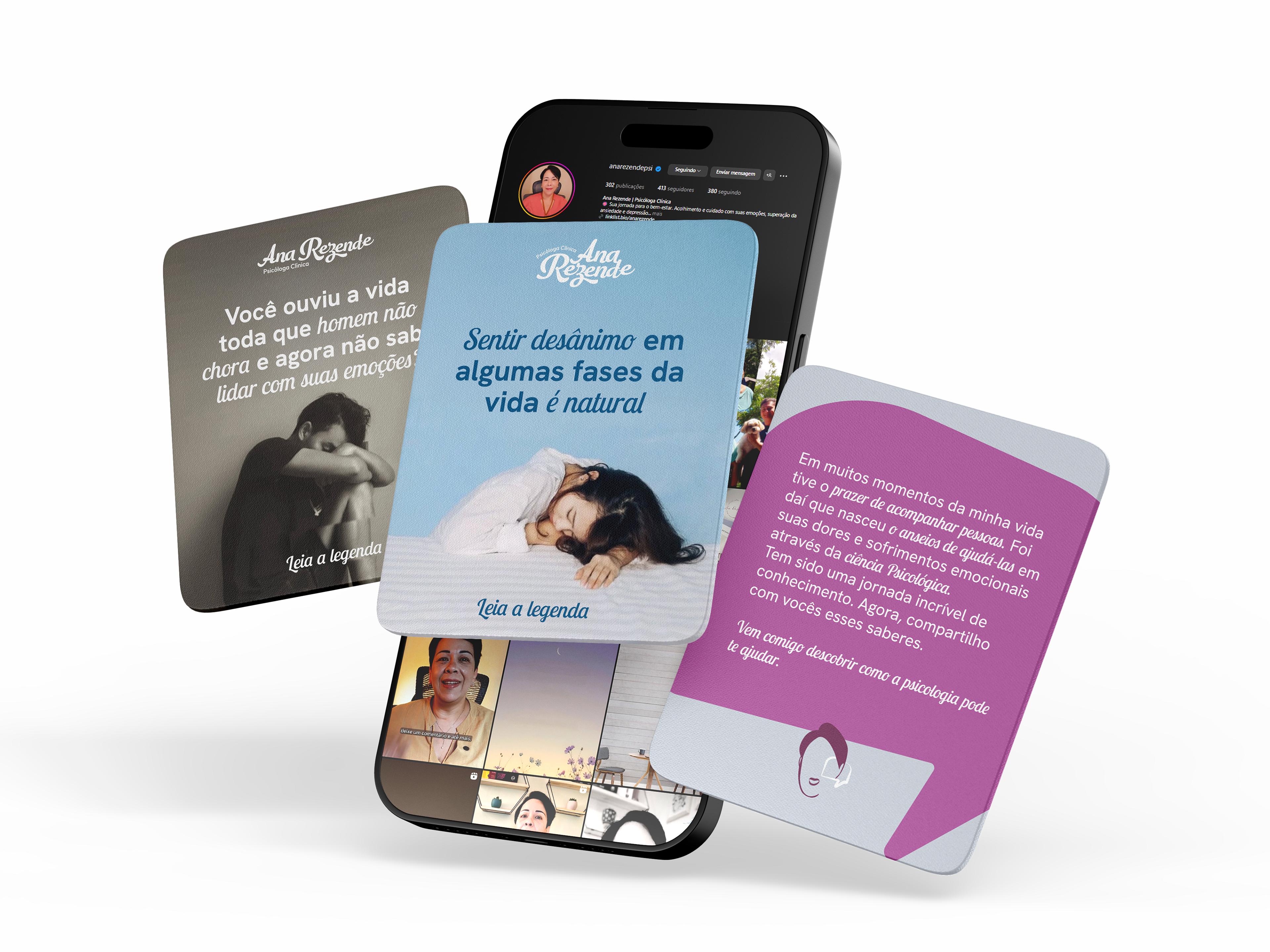
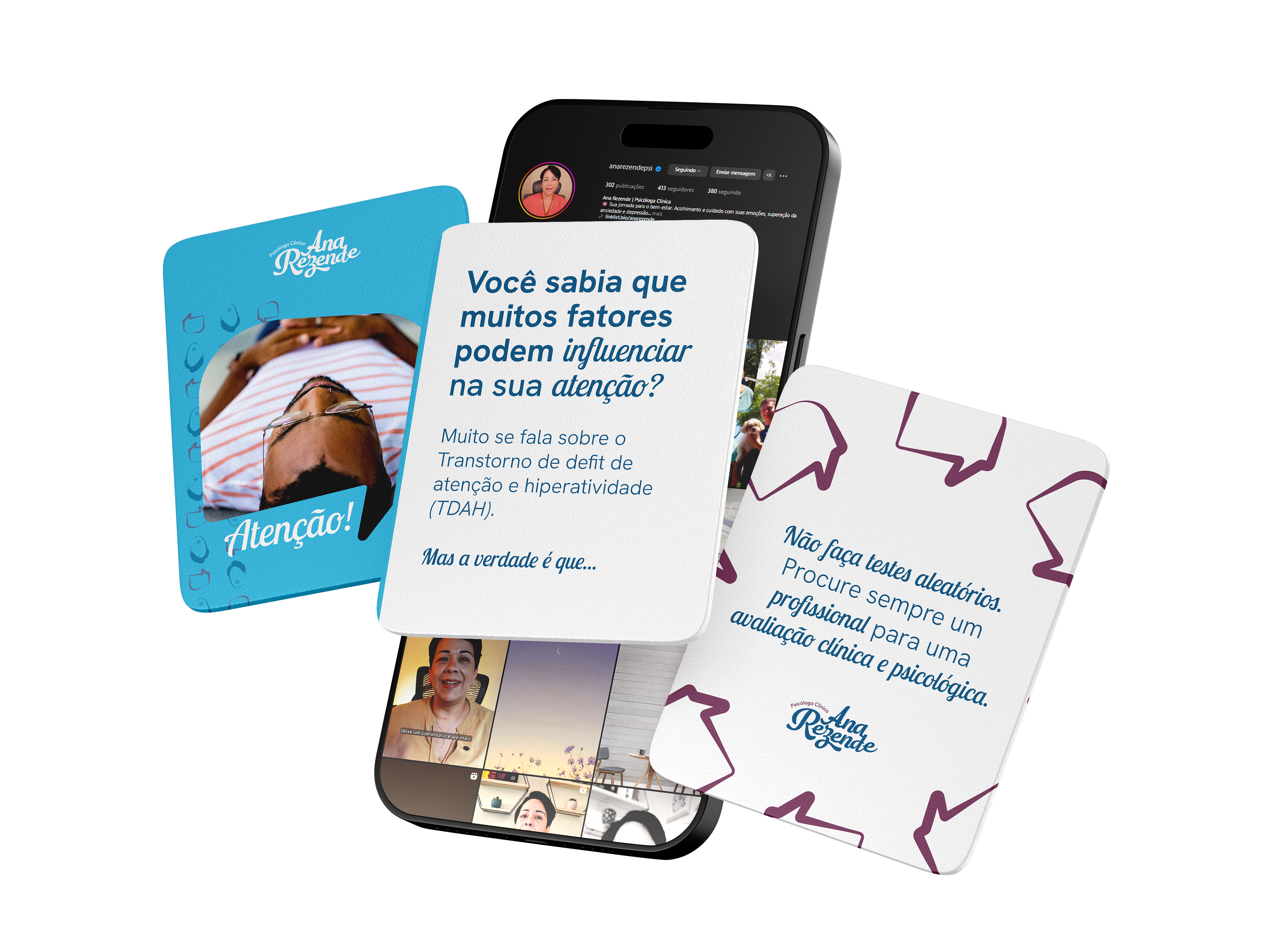
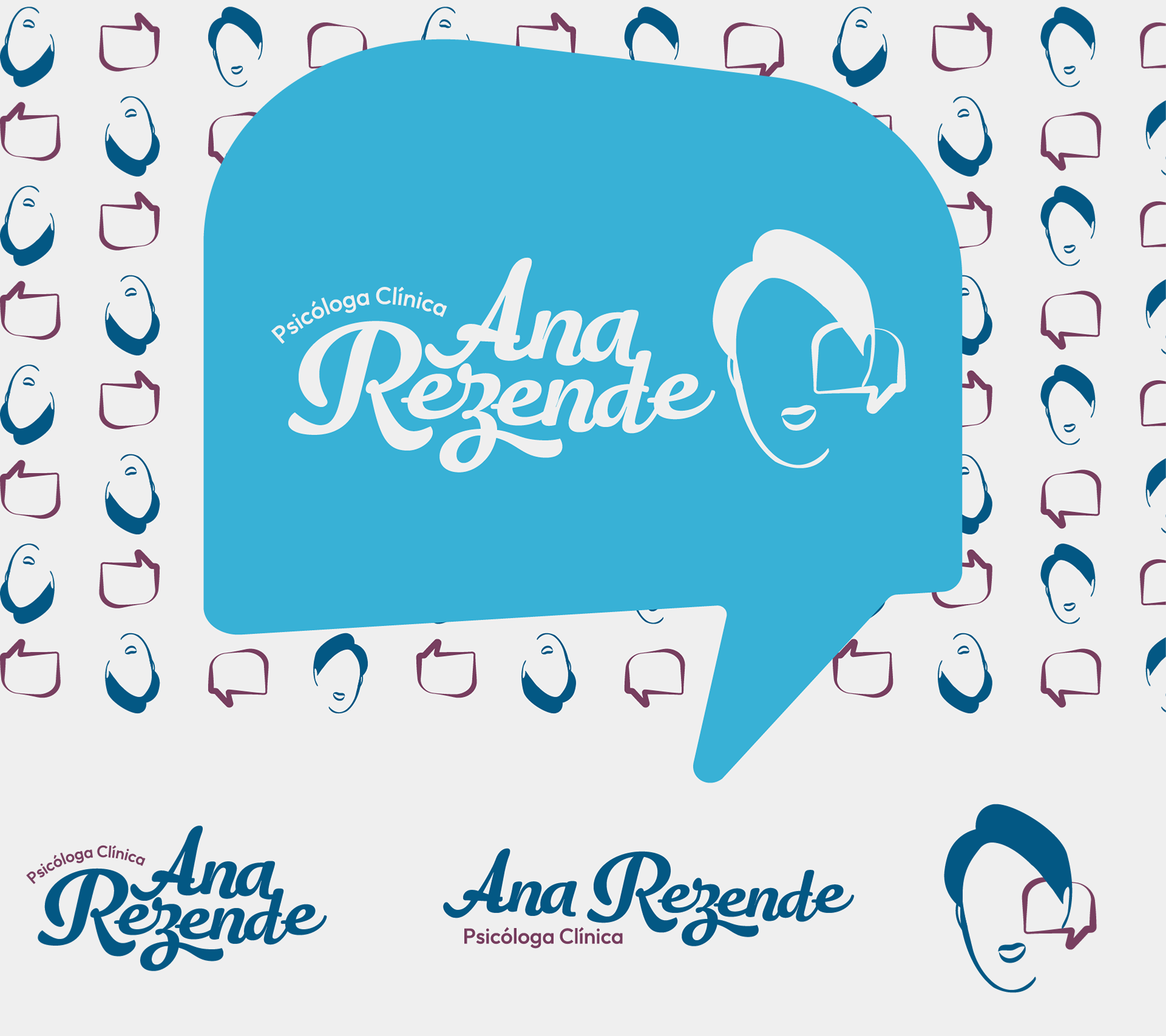
The visual identity developed for Ana Rezende was created based on the colors already present in her profile, preserving the aesthetic harmony and visual familiarity for her audience. In addition, the proposal highlights the presence of Ana herself as the central figure of the brand, reinforcing the humanization of the profile. In this way, it is clearly conveyed that there is a real person behind the content, strengthening the connection with her followers.
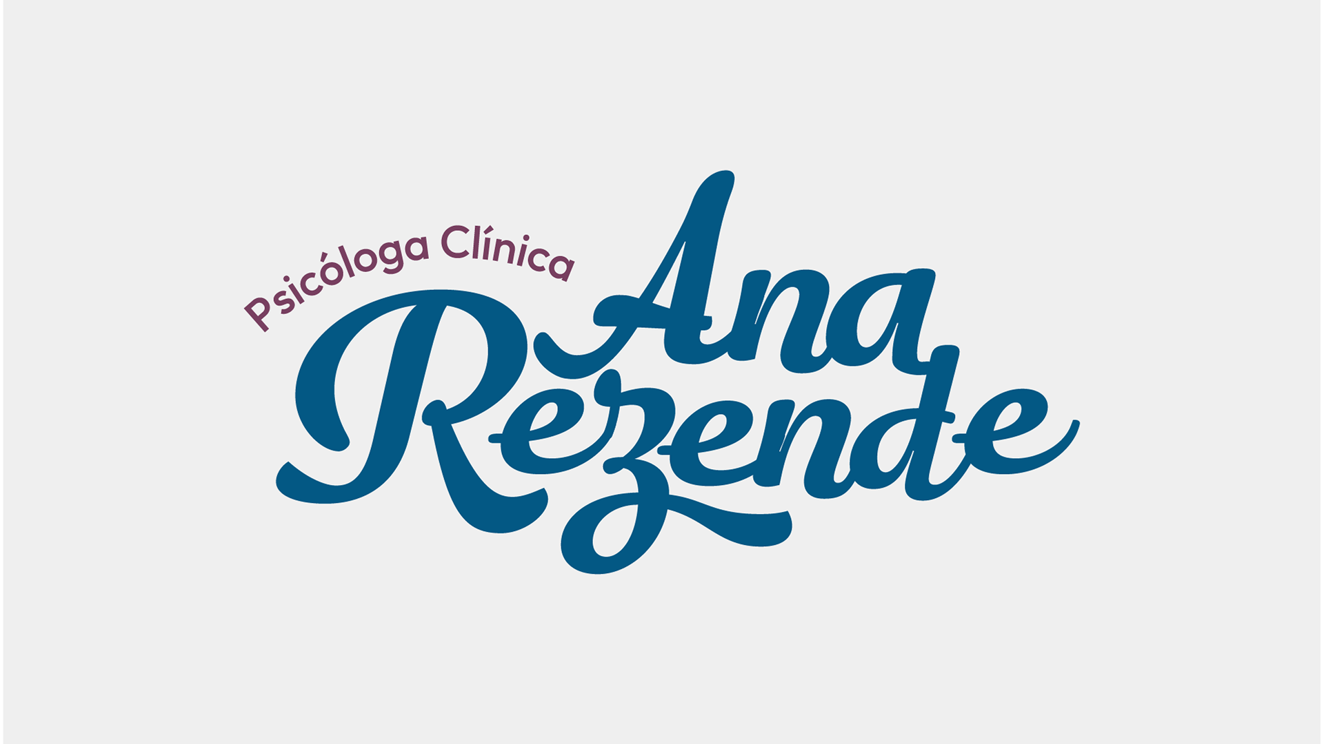
To create a more impactful brand, I change the quite obvious thin, and hard to read, font for a strong typographic foundation. Removing the noise from the old form, I add a memorable way to recognize Ana.
A Responsive Logo System:
• Primary Logo: A horizontal, high-impact version designed for storefronts, digital platforms, and large-scale signage.
• Social Media Submark: A stylized portrait avatar that serves as a memorable secondary mark, bridging the gap between the brand and its real-world inspiration.
• Social Media Submark: A stylized portrait avatar that serves as a memorable secondary mark, bridging the gap between the brand and its real-world inspiration.
Key Improvements for the New Logo:
Hierarchy: The brand name "Ana Rezende" is now unmistakably the core focus. It is bold, prominent, and center-stage, completely resolving the previous issue where a delicate font competed for attention.

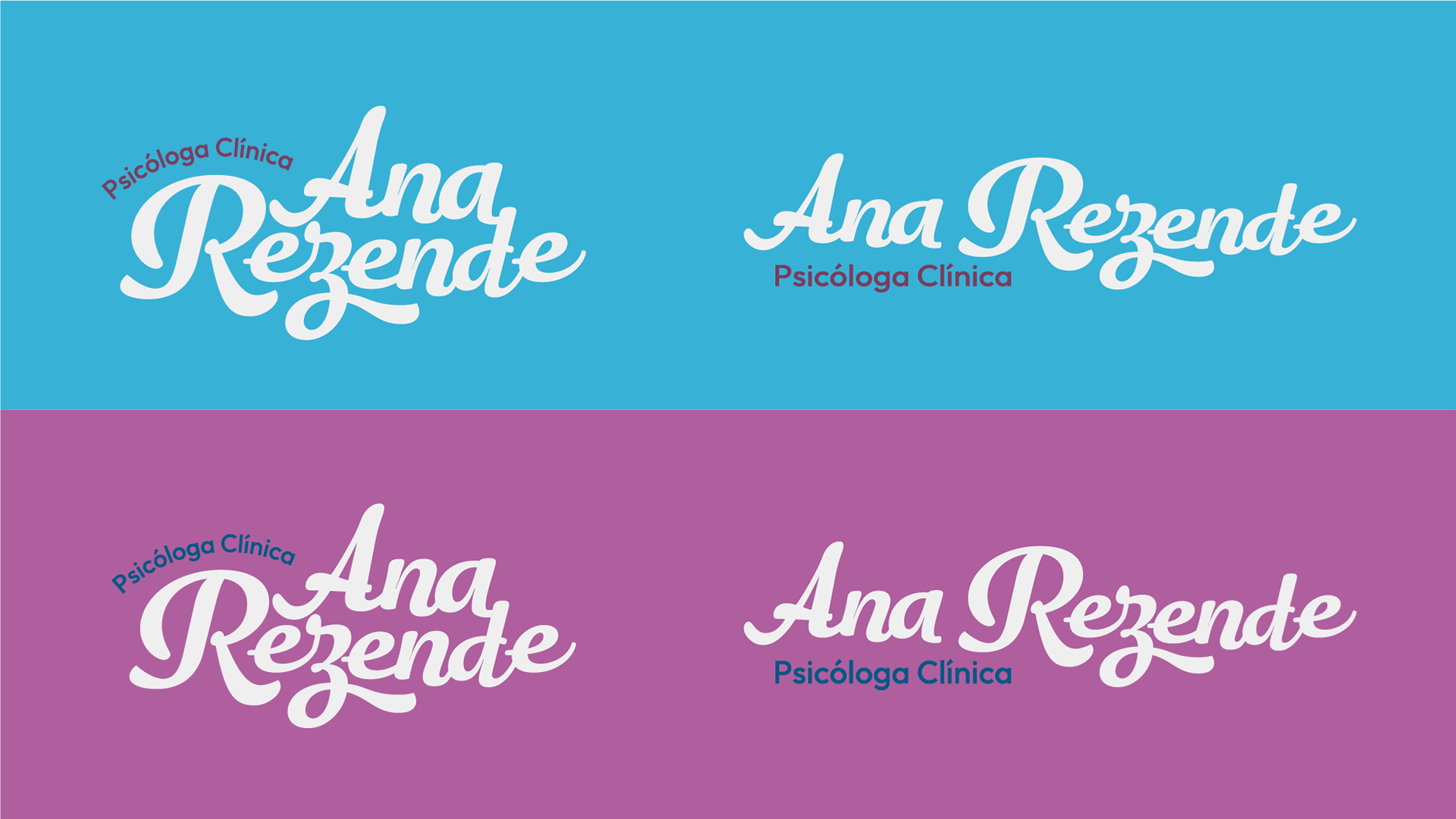
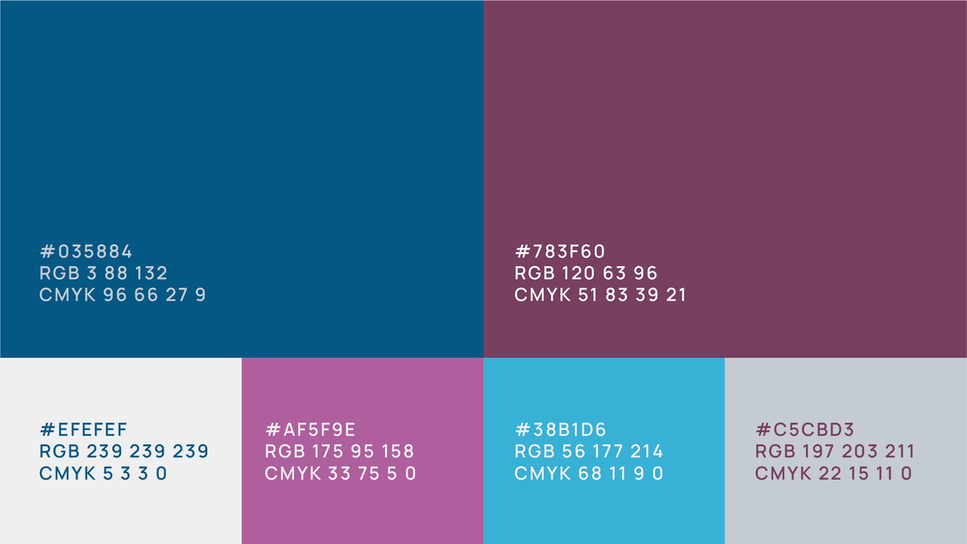
• Color Palette: Our colors are a primary factor in our identity. Color codes, references, and approved color pairs are listed below to ensure proper combinations.
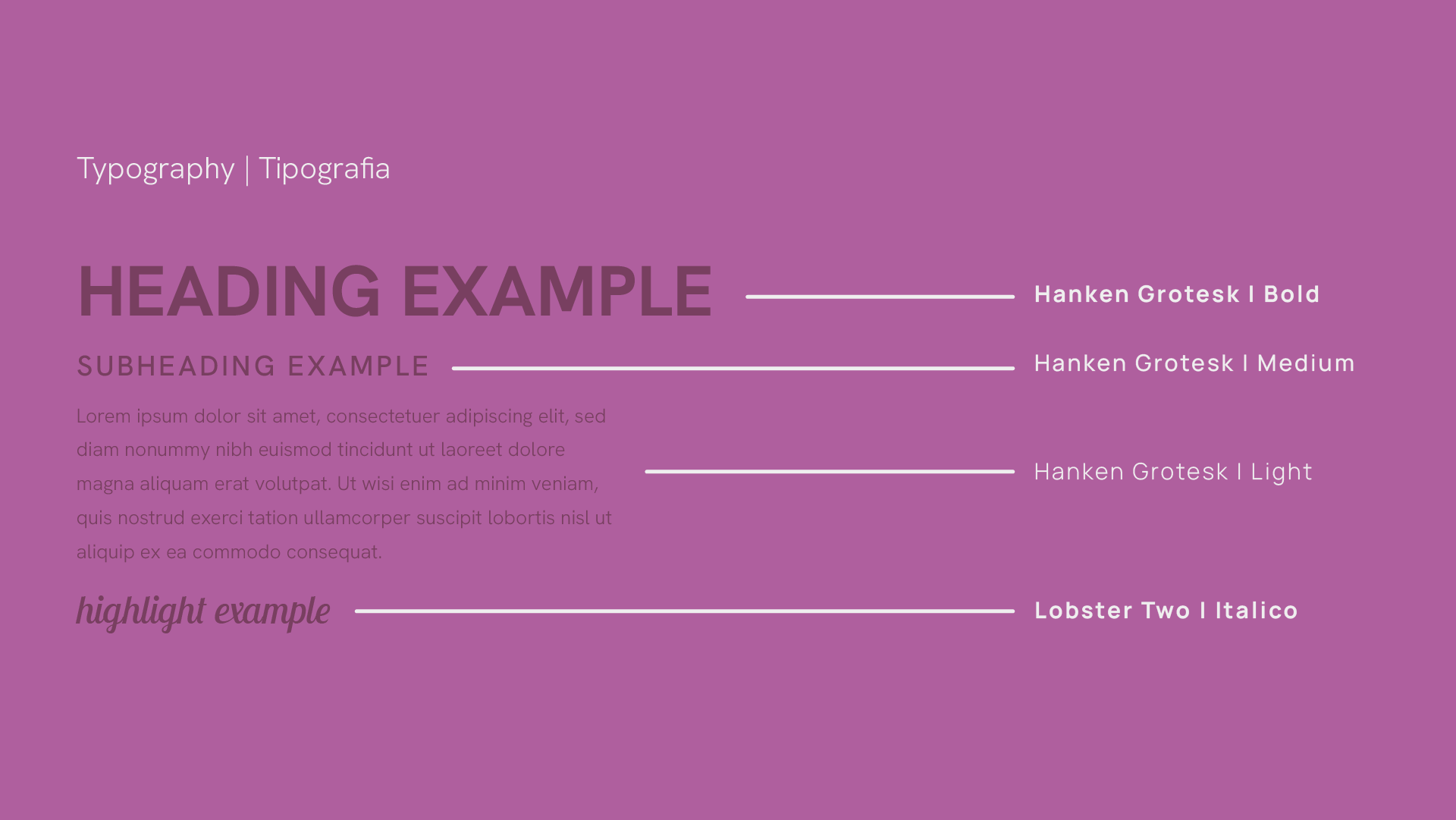
• Typography: The fonts used in our identity are intentional and essential to maintaining a strong, consistent brand. Find the names and characteristics of our typography below.
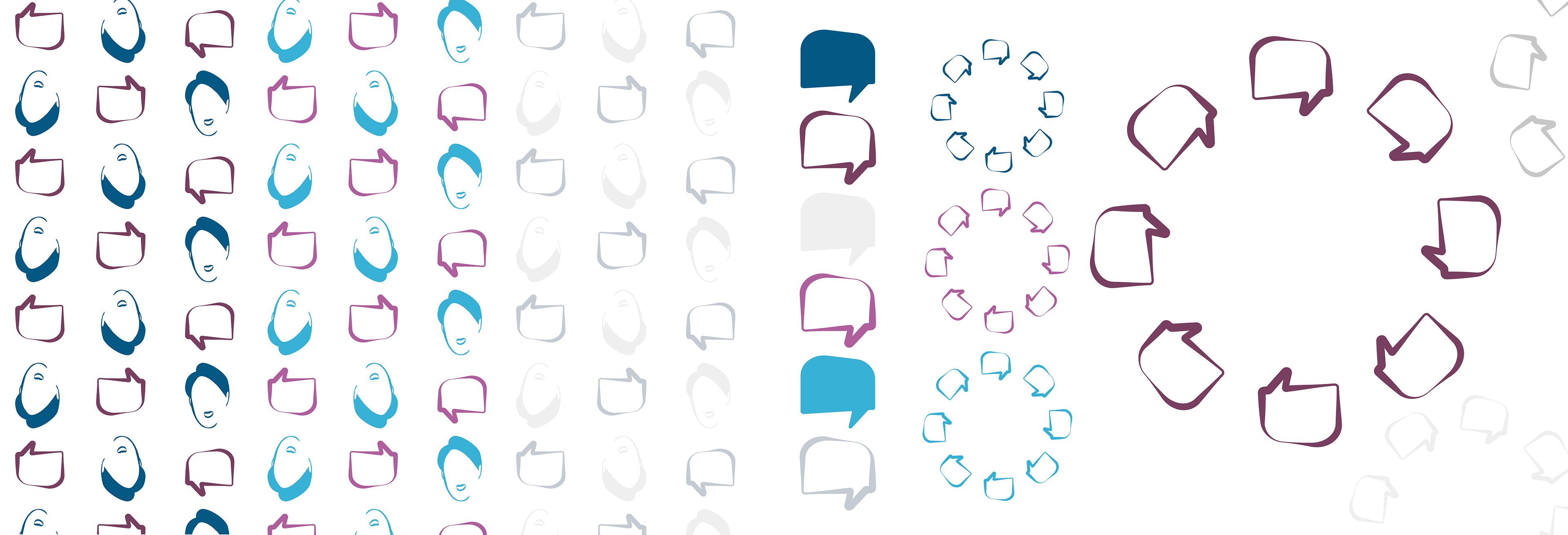
• Visual Patterns: To add texture and depth to the brand, custom geometric patterns were designed to support digital and print assets. Explore the pattern variations below.