DOCE ENCANTO STORE
BRANDING | LOGO DESIGN | ART DIRECTION
Doce Encanto is a children’s retail brand that celebrates the joy of childhood. The original visual identity was overly complex, with excessive details that hindered scalability and brand recognition. My goal was to transform this identity into a modern, professional, and scalable brand system that maintains its playful heart while speaking clearly to parents and children alike.
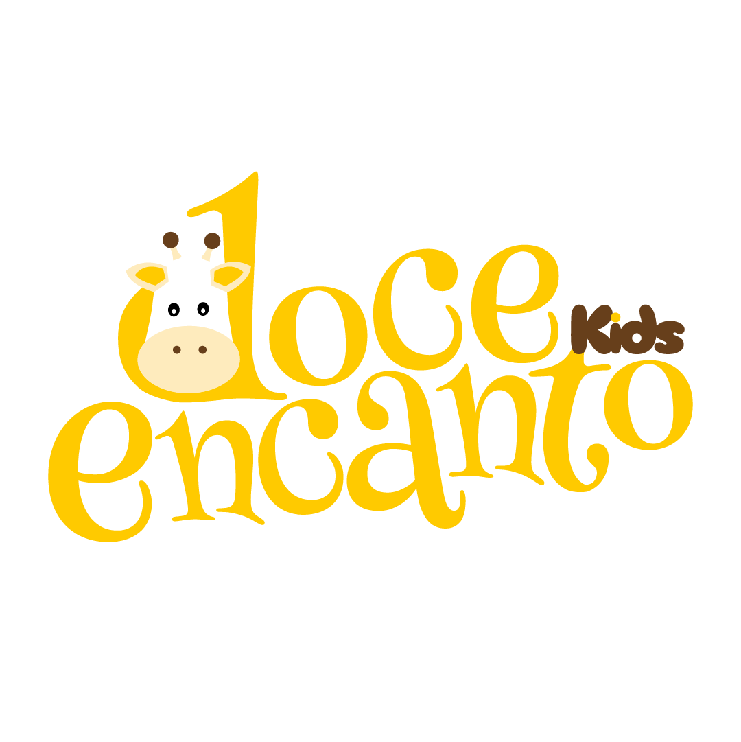
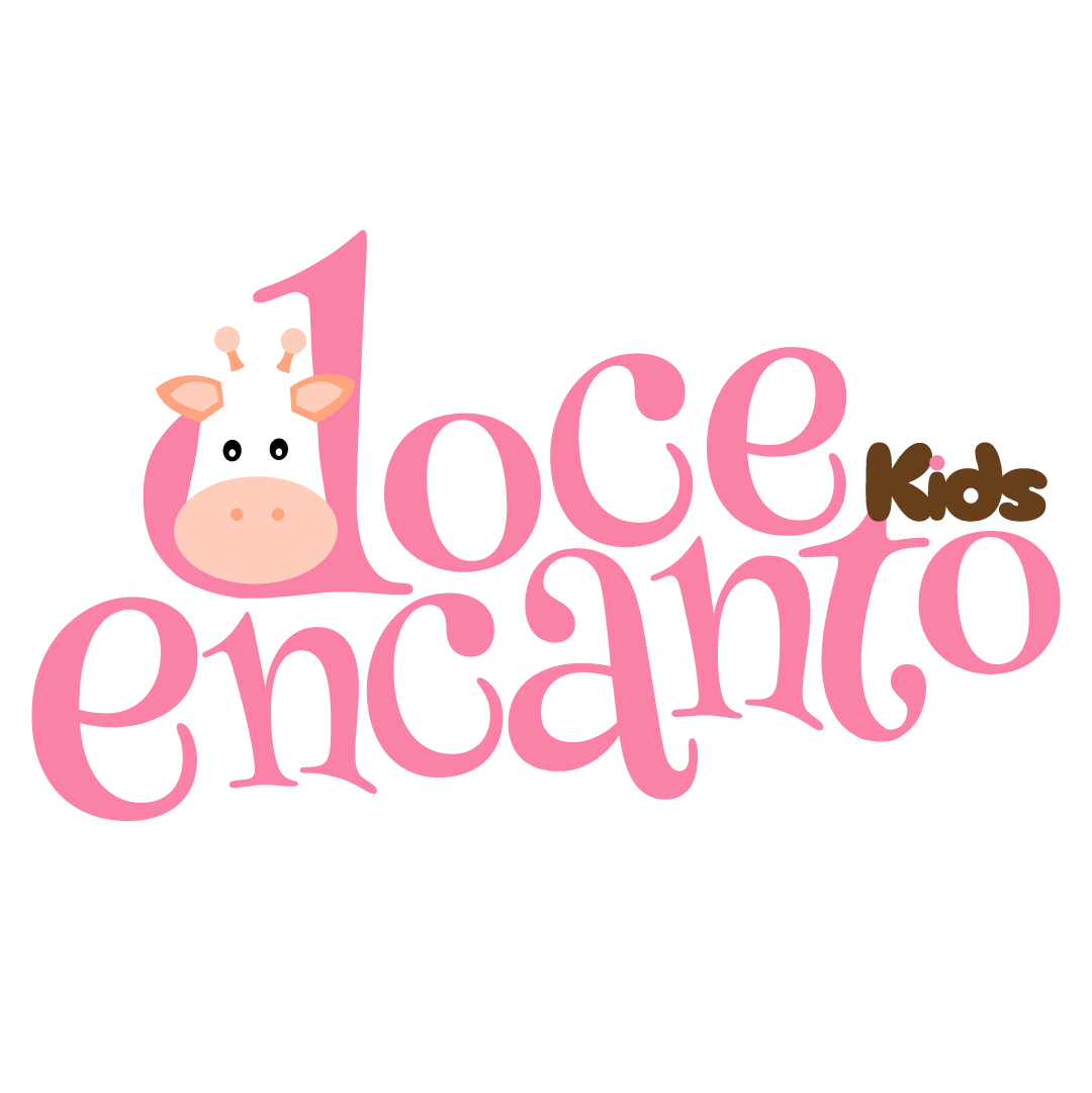
To create a more impactful brand, I stripped away the visual noise and focused on a strong typographic foundation. The primary logo features a clever integration where the brand’s giraffe mascot is built directly into the letter "D." This creates a unified and memorable mark that works perfectly across both digital and physical platforms.
Recognizing the diverse needs of a modern brand, I developed a responsive logo system:
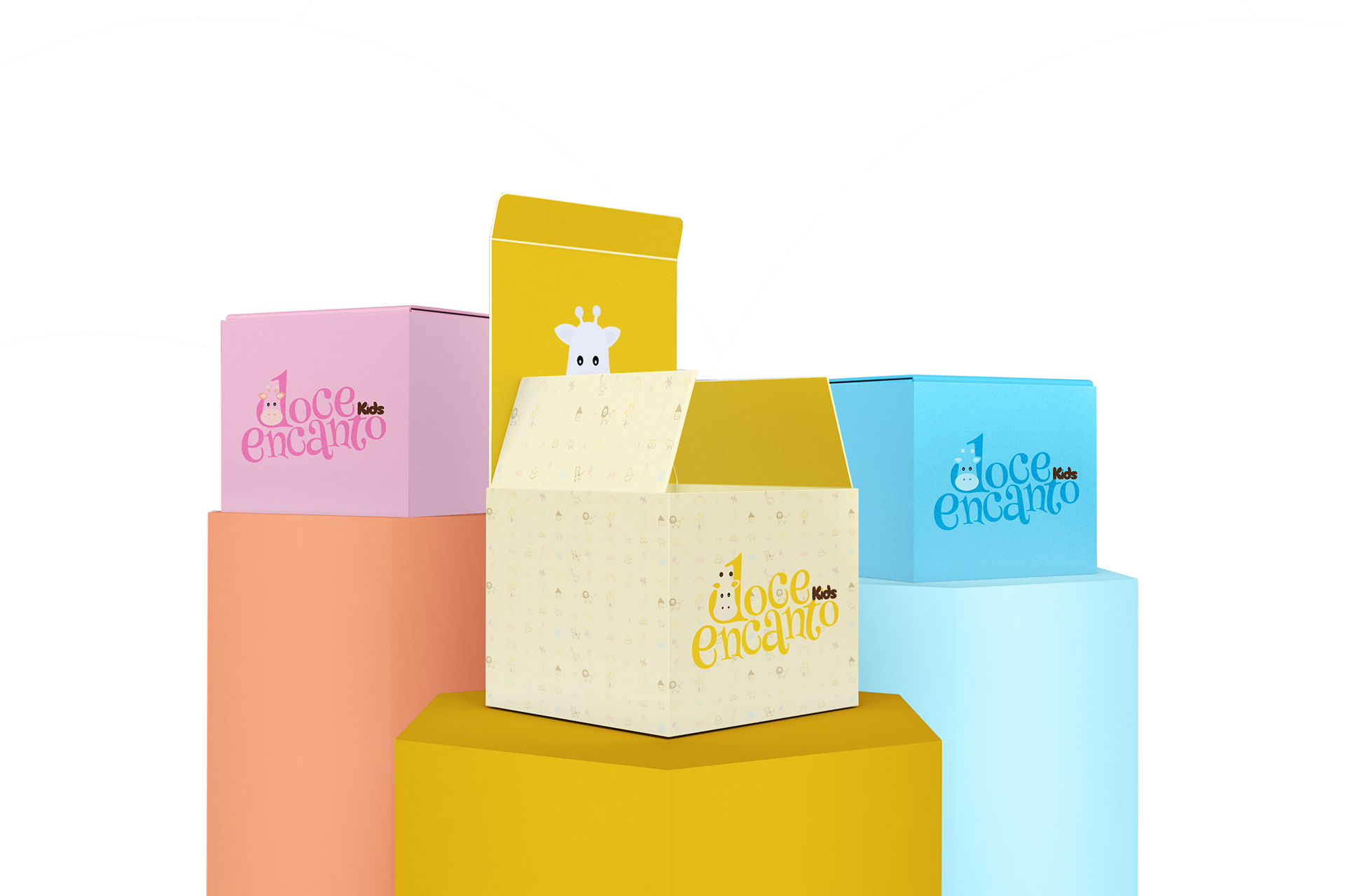
Primary Logo: a horizontal, high-impact version designed for storefronts, websites, and large-scale signage.
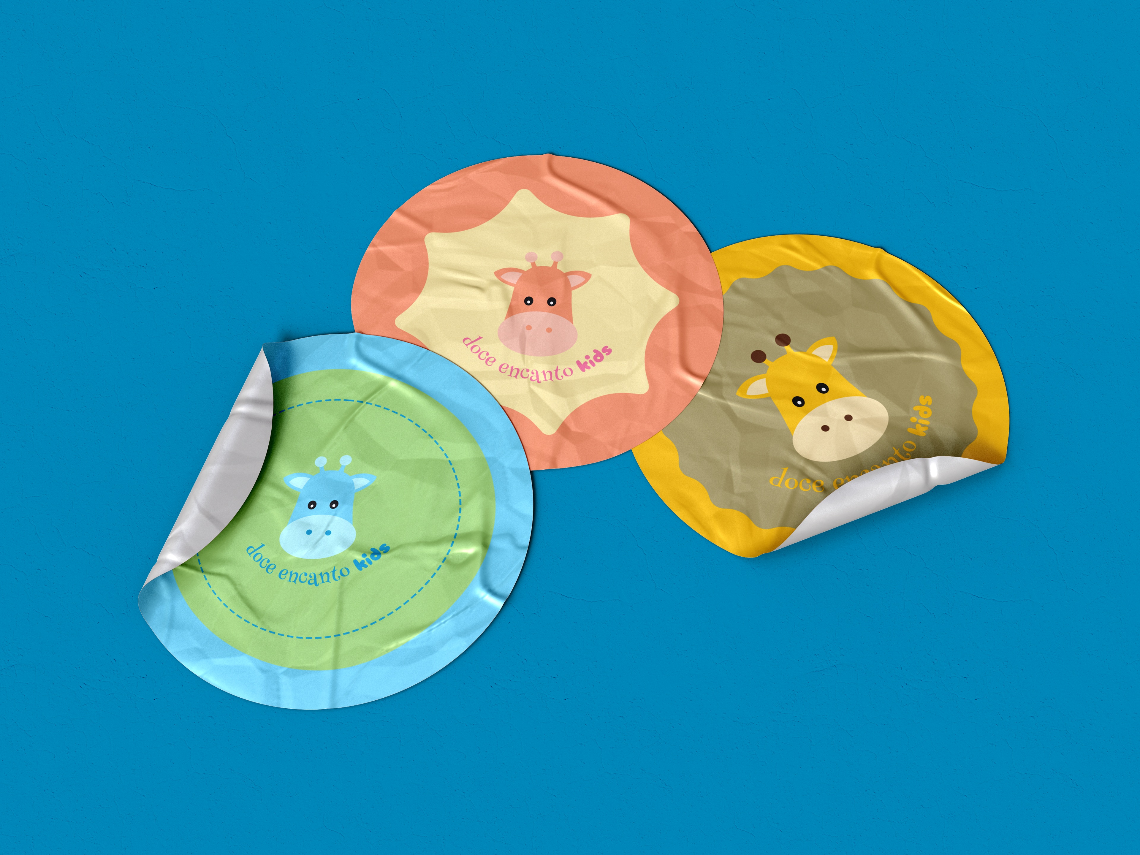
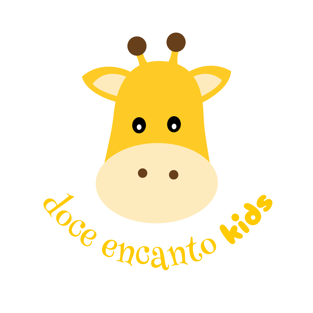
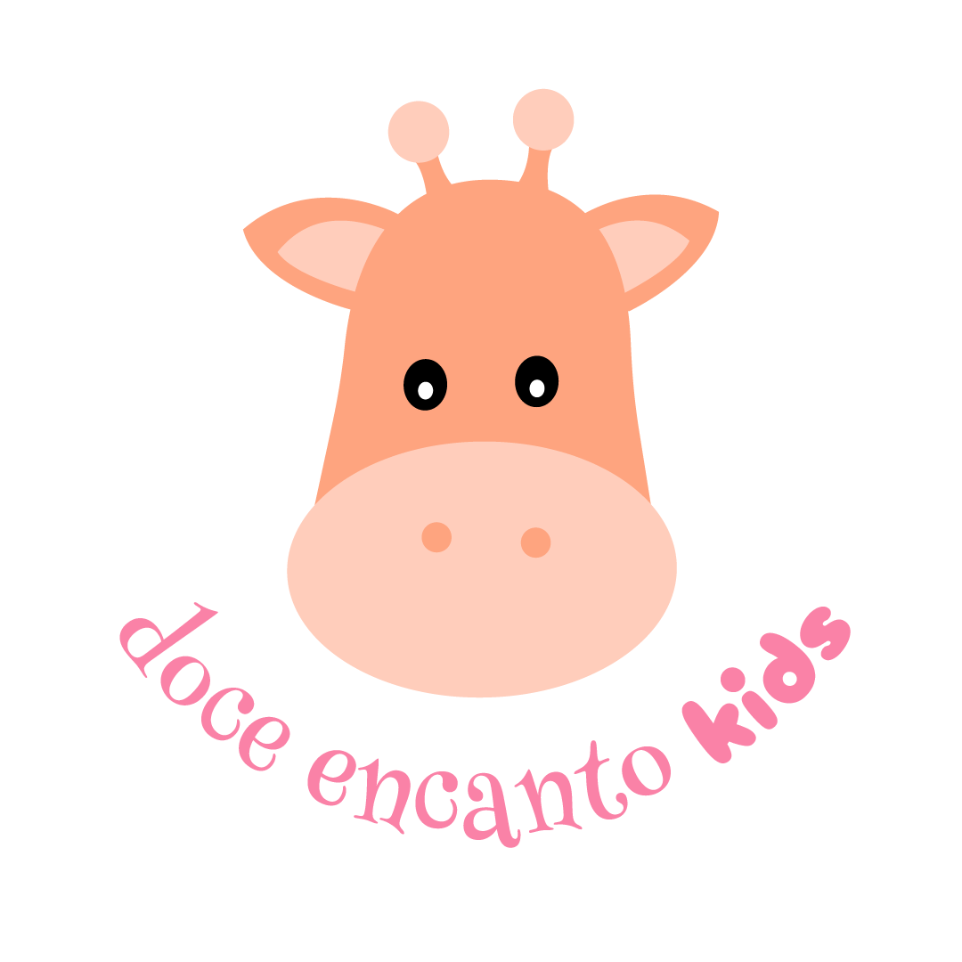
Social media submark: a secondary circular variation optimized for avatars and stickers. This version ensures the brand remains legible and engaging within the constrained spaces of platforms like Instagram and WhatsApp.
Social media submark: a secondary circular variation optimized for avatars and stickers. This version ensures the brand remains legible and engaging within the constrained spaces of platforms like Instagram and WhatsApp.
Key improvements for new logo:
Hierarchy: the brand name "Doce Encanto" is now unmistakably the main star. It is bold, prominent, and center-stage. This completely fixes the issue where the mascot was competing for attention.
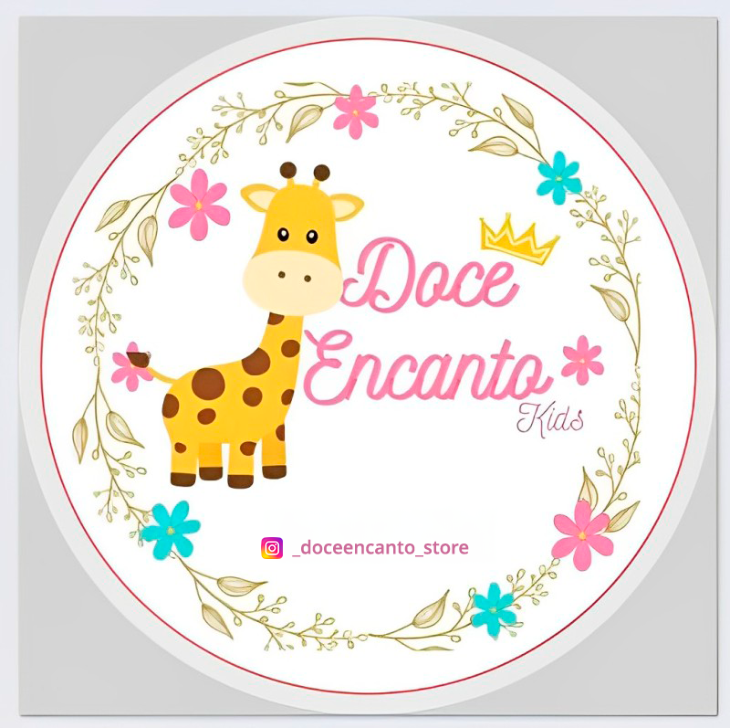
Readability: the font I've chose is bold and incredibly legible. This is a massive improvement over the thin script of the old design.
Mascot integration: integrating the giraffe character into the 'D' of "Doce" is the smart design solution. It makes the logo feel much more unified, rather than just placing a text block next to an illustration.
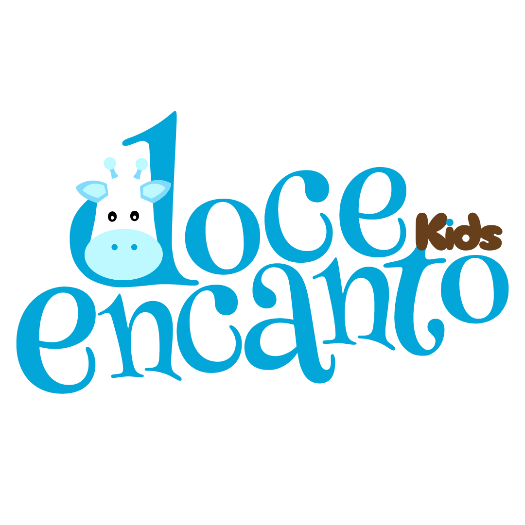
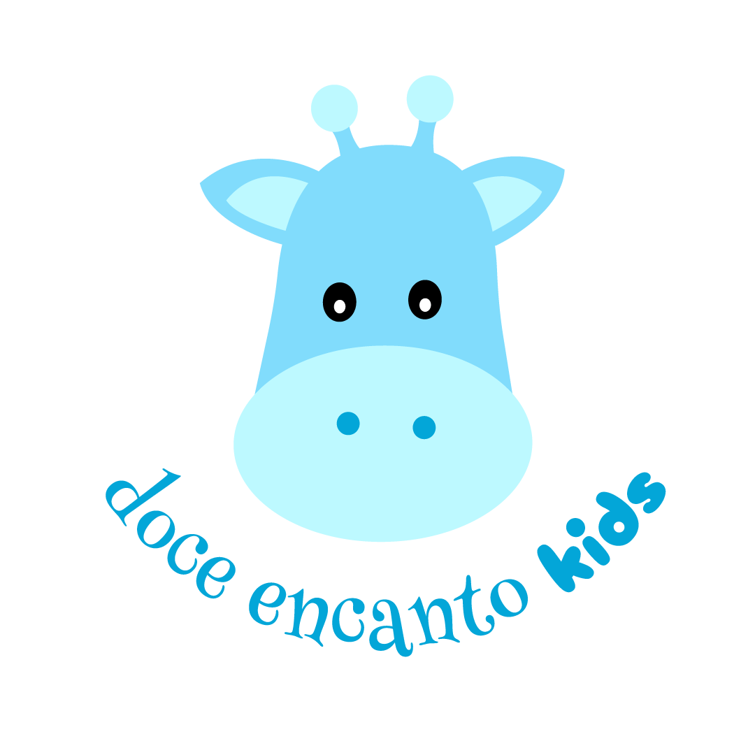
Clean and scalable: by stripping away the wreaths, tiny flowers, crown, and social media handles, I have created a clean mark that will look excellent at any size. The clutter is gone, as you can check below in the variations of the logo:
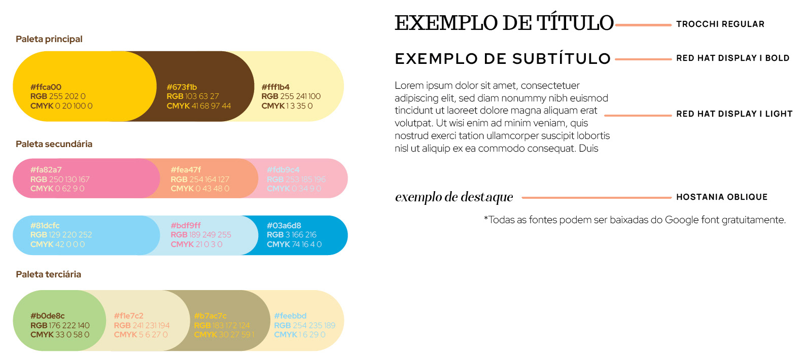
Thinking about the color palette, I sought harmony and joy, highlighting the lightness of the brand, intimately linked to the posts.
The colors were separated into three main groups, offering many combination options that resonate with the brand and allow for variations.
The colors were separated into three main groups, offering many combination options that resonate with the brand and allow for variations.
The fonts are fun, and we have three options: a primary one for titles, a second for general text, and another to be used for highlighted moments.
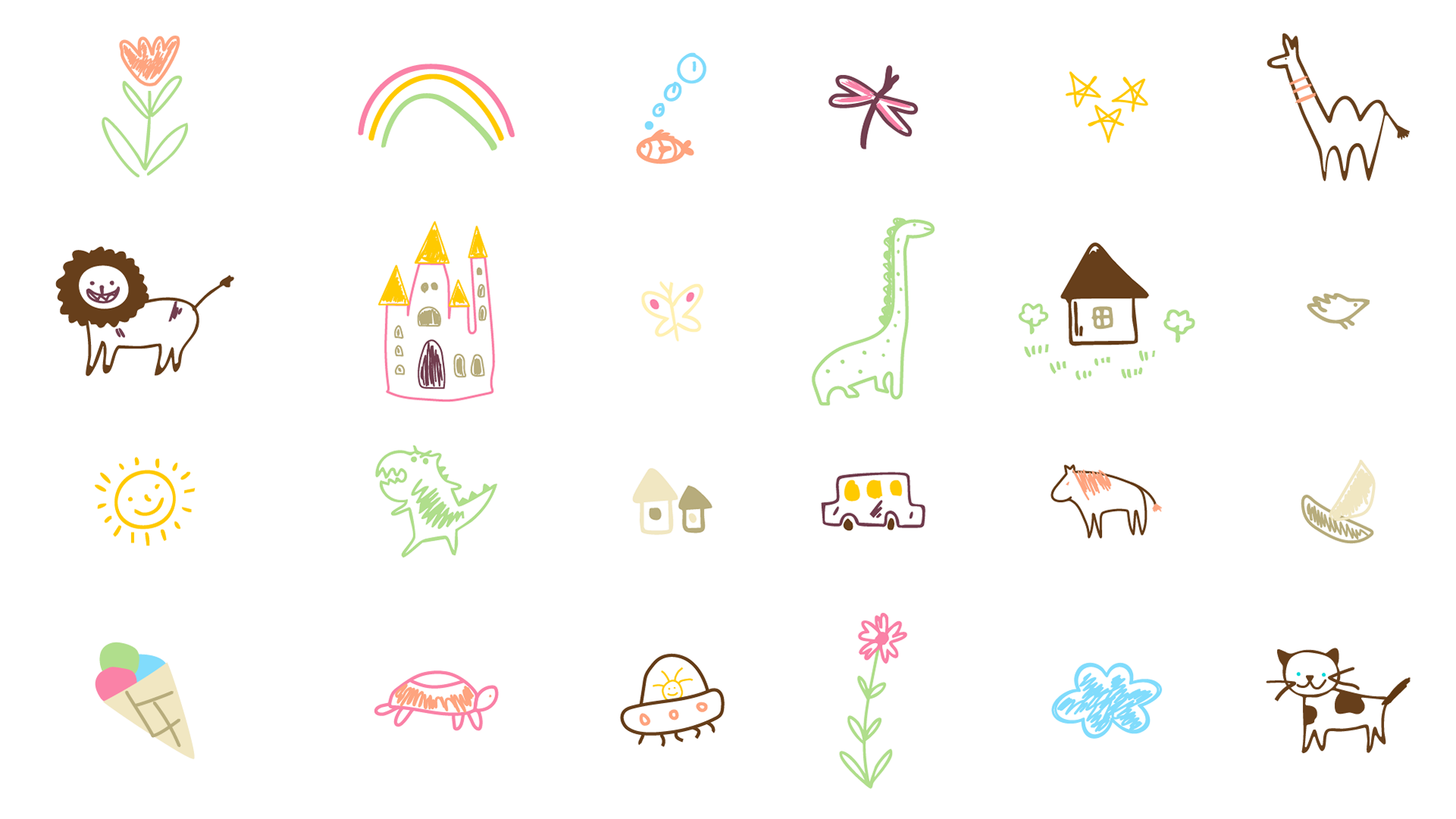
Creating a pattern helps reinforce the brand's visual identity, conveying consistency and recognition across different applications in an elegant and memorable way.
The shapes will support composition with photos, texts, and even just for composing photos that will go to social media and the website.

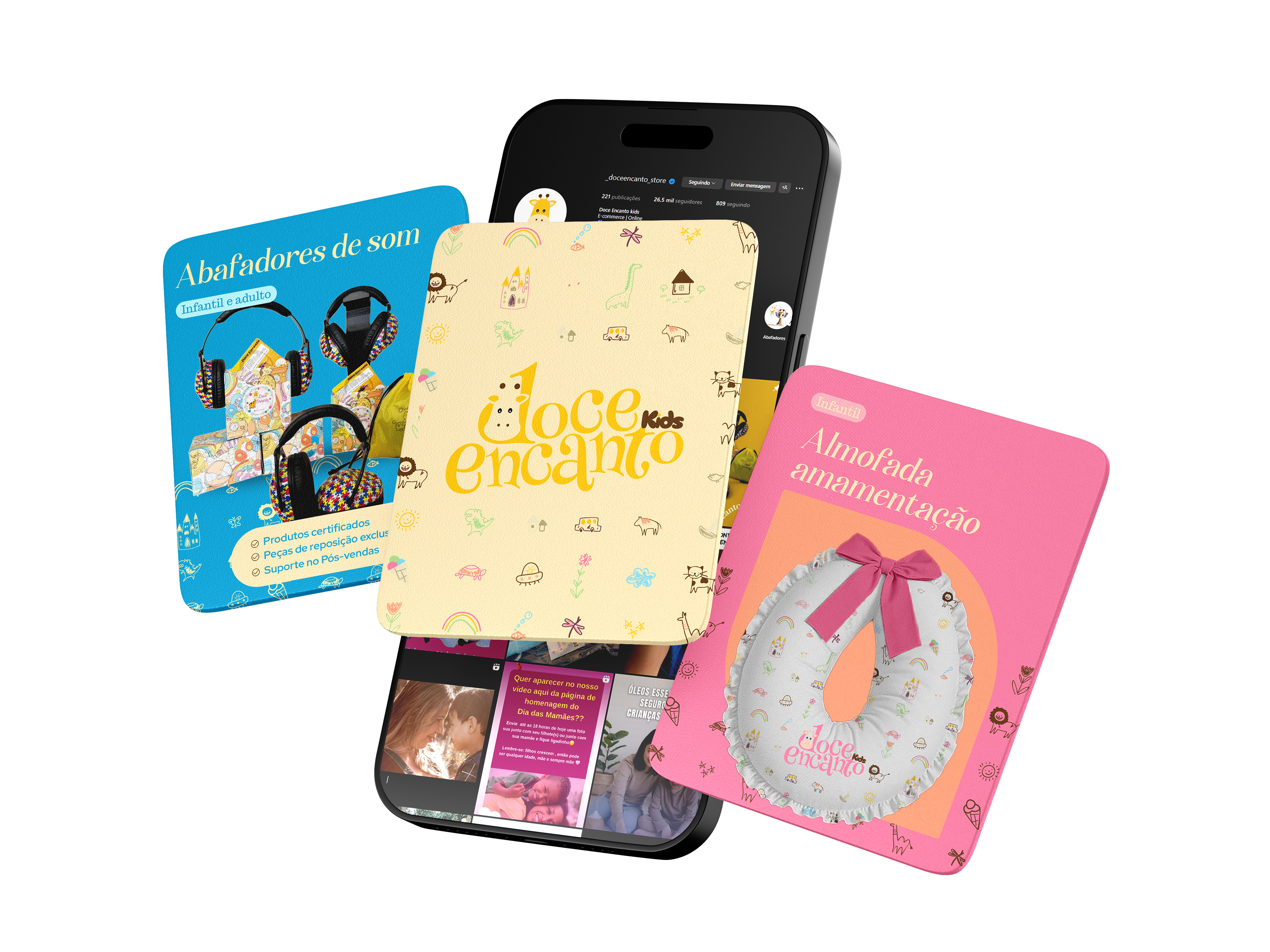
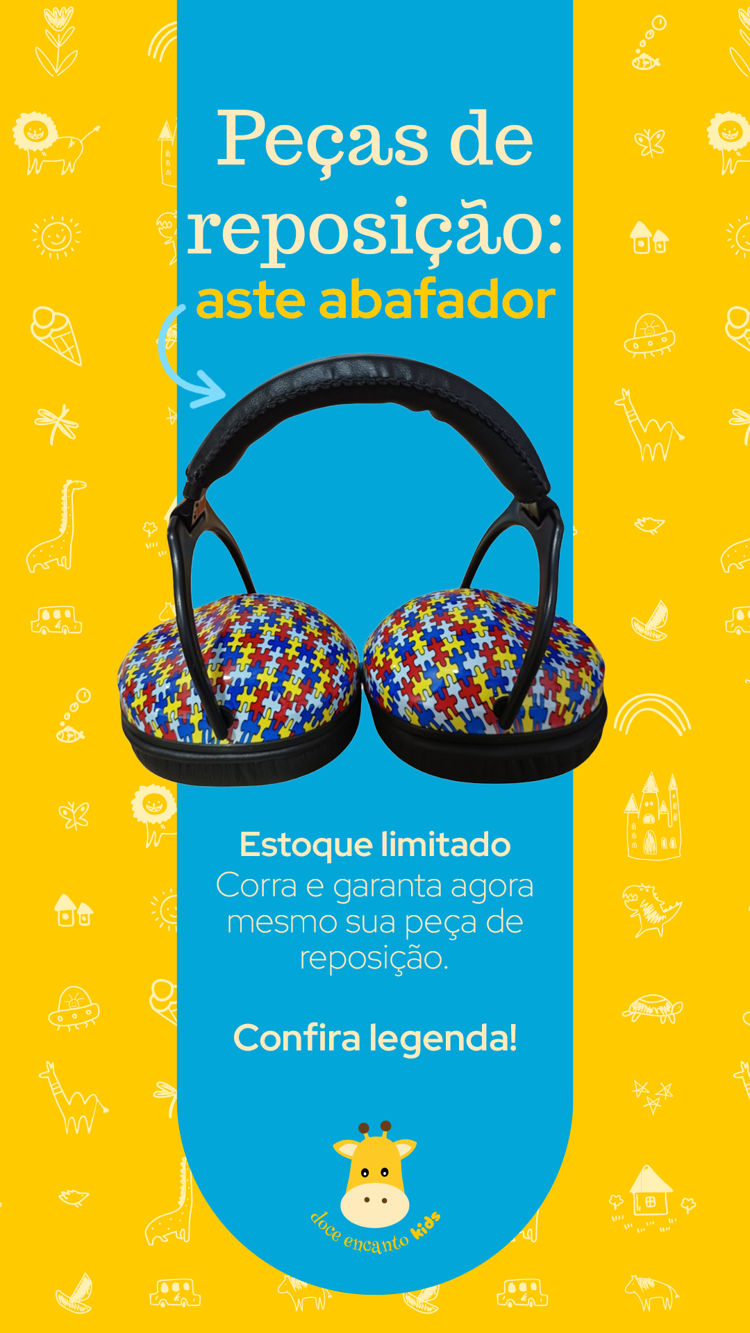
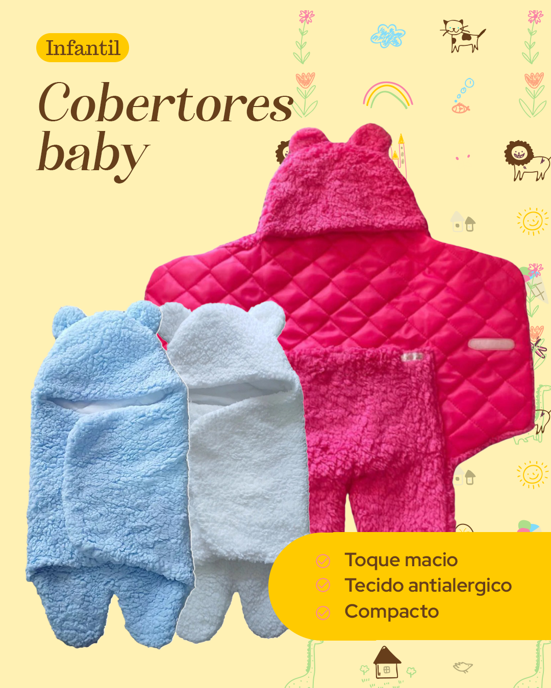
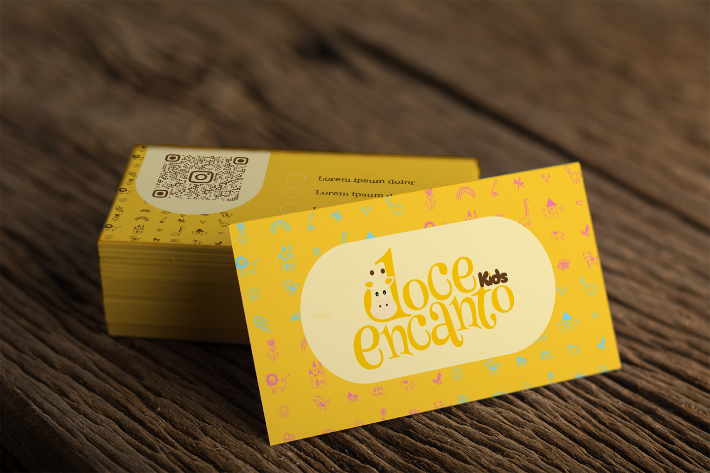
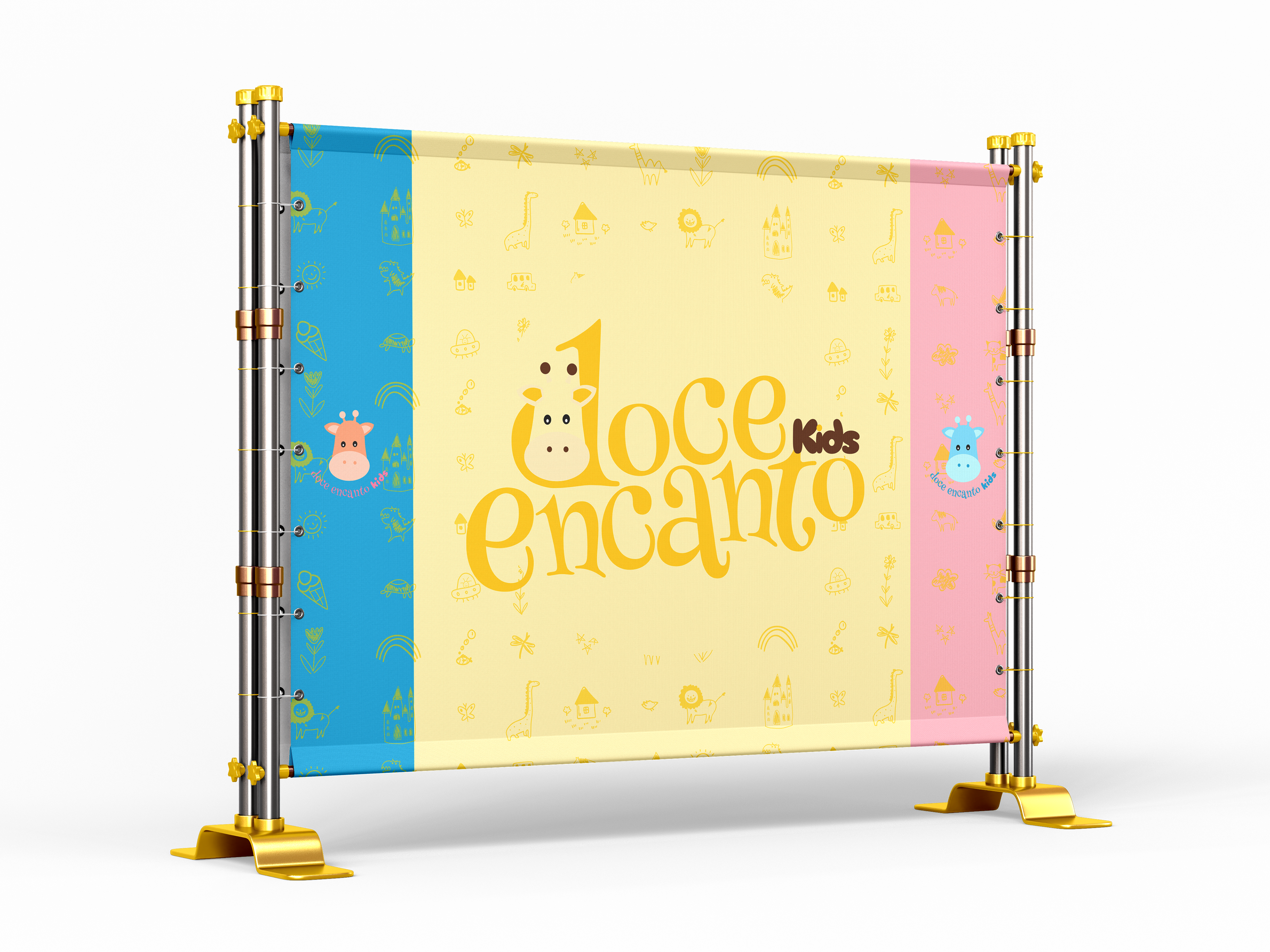
To demonstrate the versatility of the new visual identity, I developed a series of mockups that bring the brand to life across various touchpoints. From store signage to custom packaging, these applications show how the logo system scales seamlessly between digital and physical environments, maintaining its playful charm and professional edge.