MAPFRE
GRAPHIC DESIGN | PRINT | INTERNAL COMMUNICATION
MAPFRE’s internal communication team faced a significant challenge in engaging their commercial insurance brokers. The goal of this project was to enhance clarity, engagement, and visual consistency across all key communication materials.
The Assets
Newsletter: Previously text-heavy and underperforming, I developed a new visual approach focused on information hierarchy and readability to recapture reader interest.
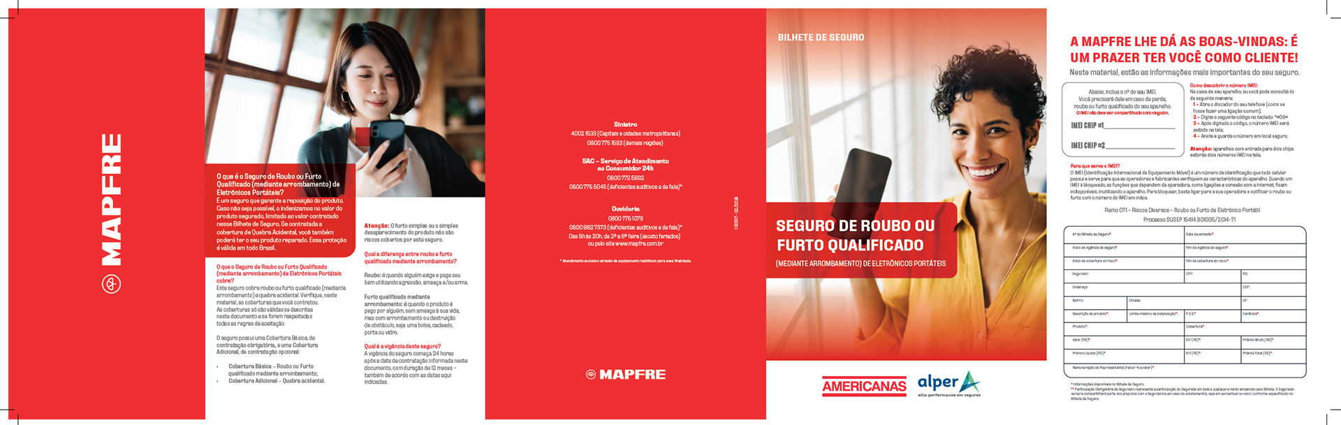
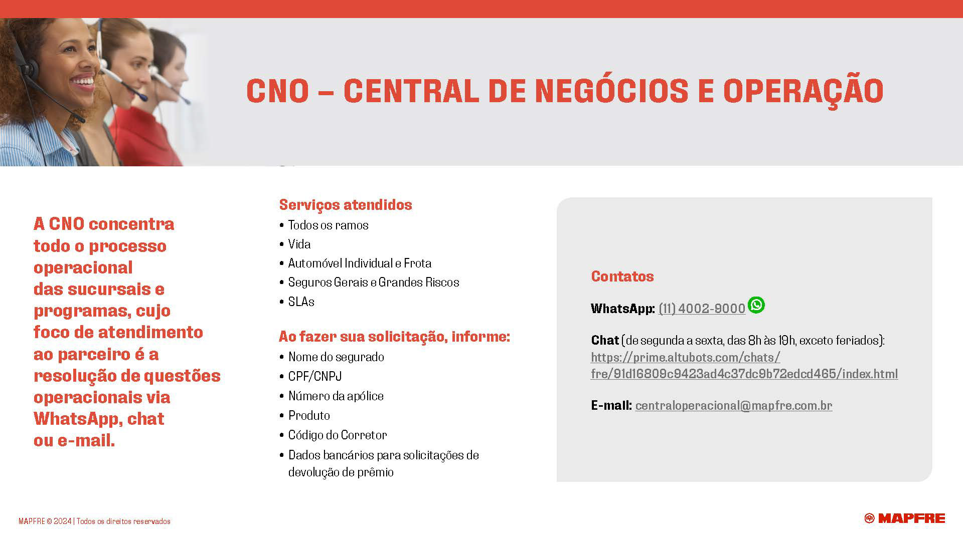
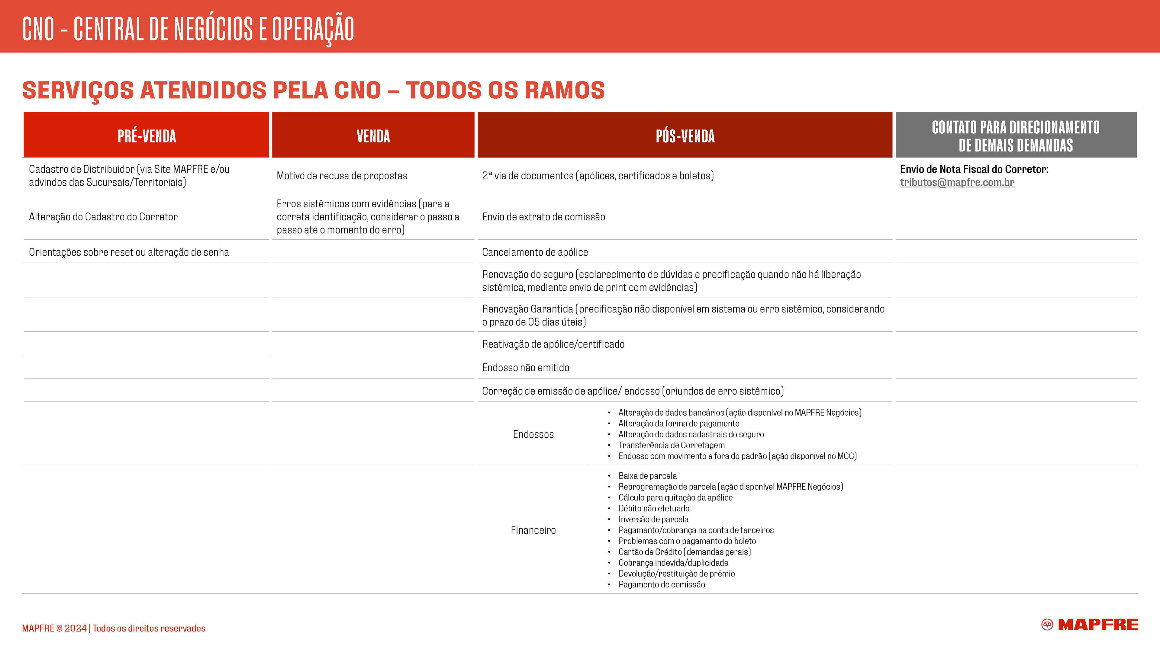
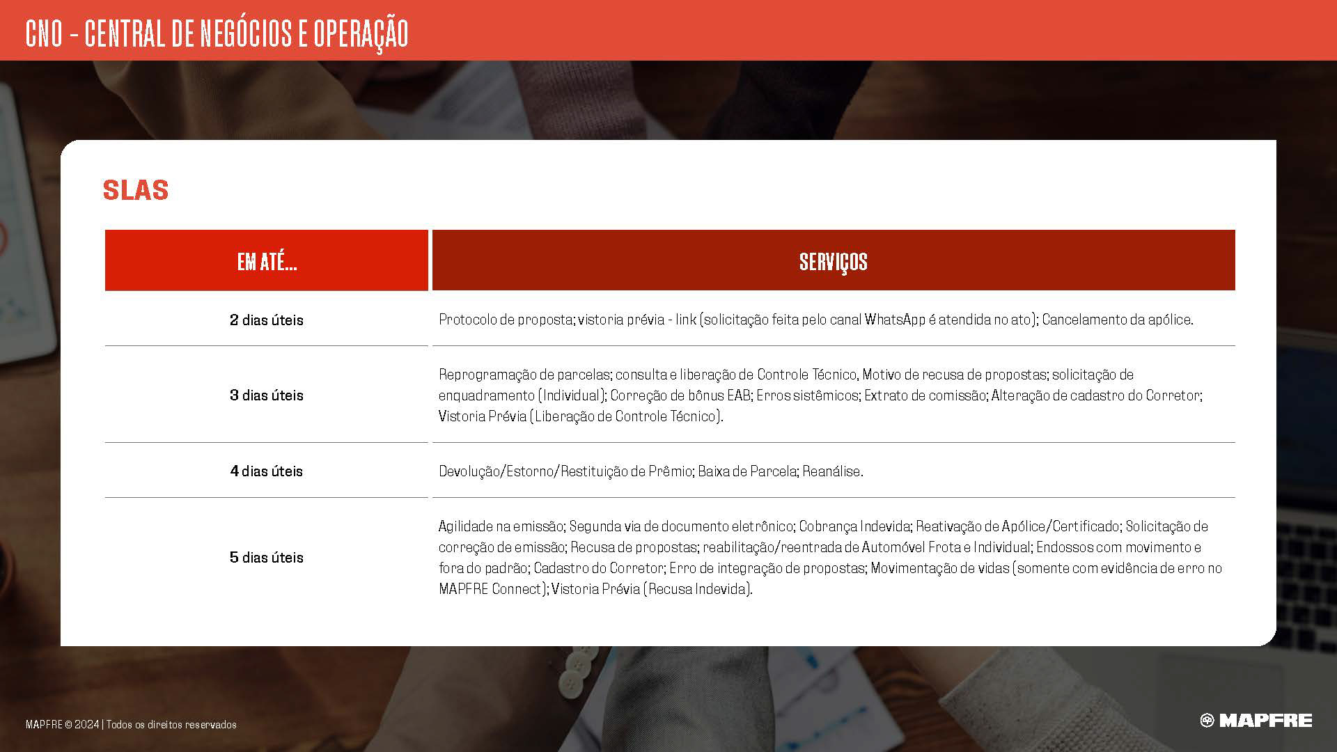
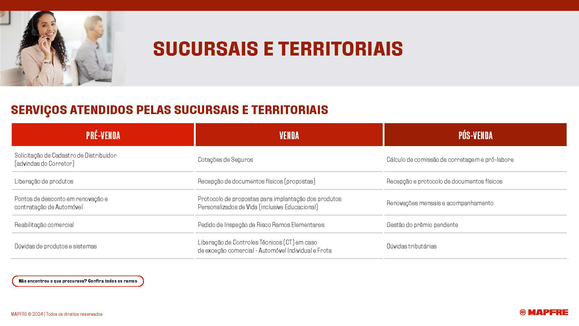
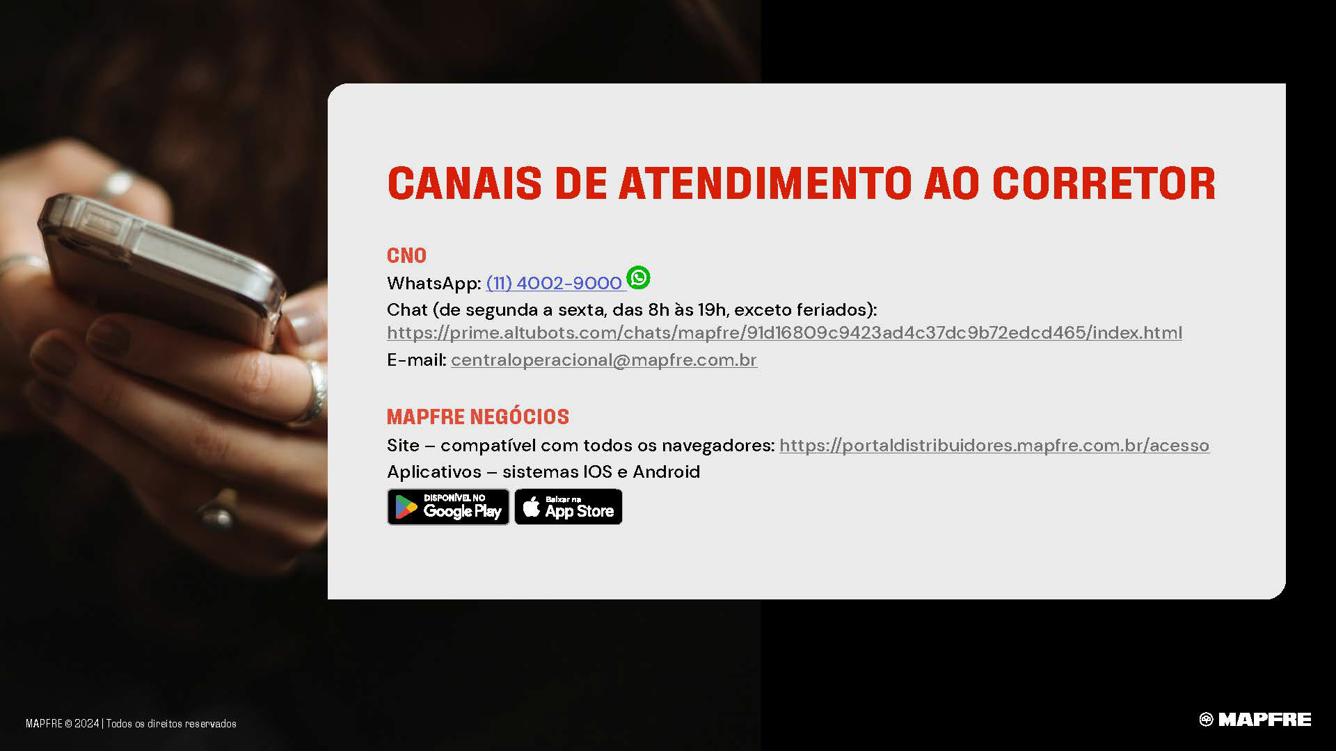
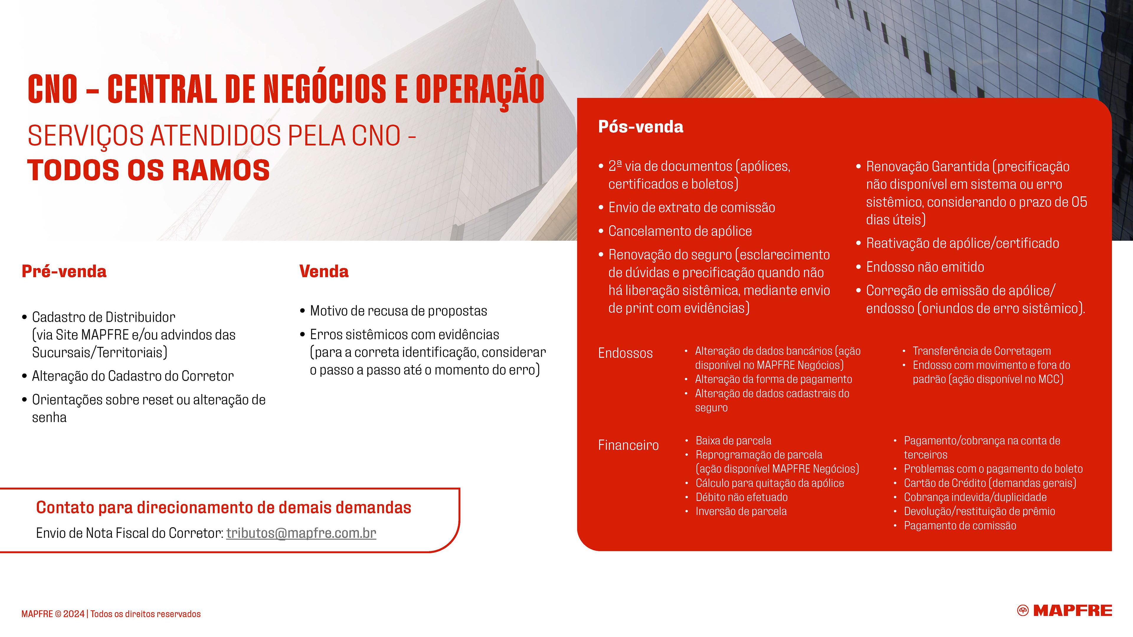
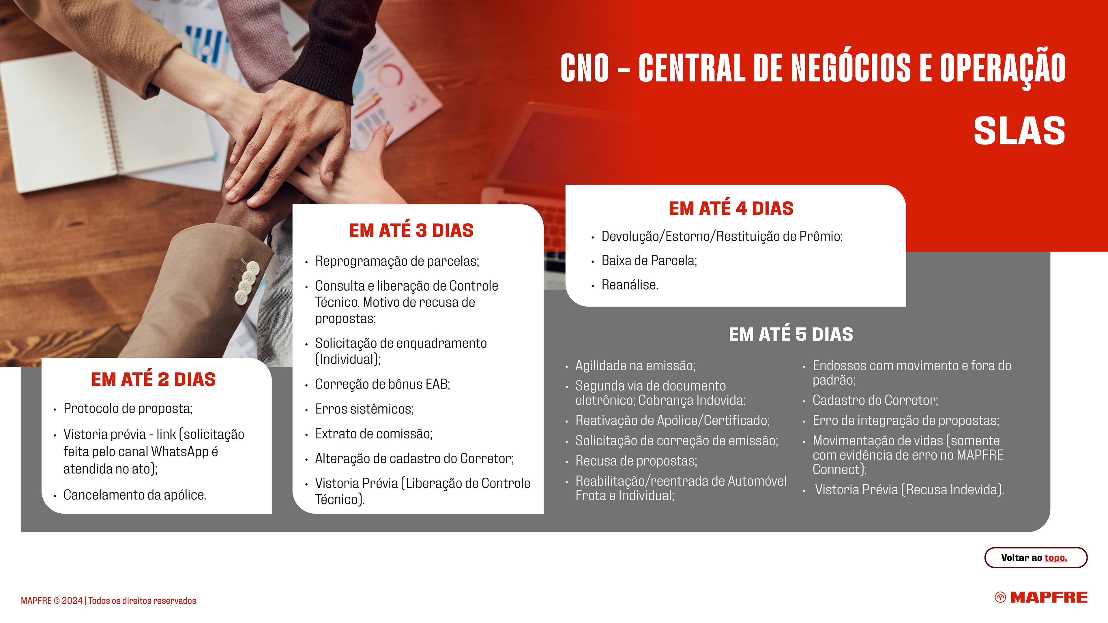
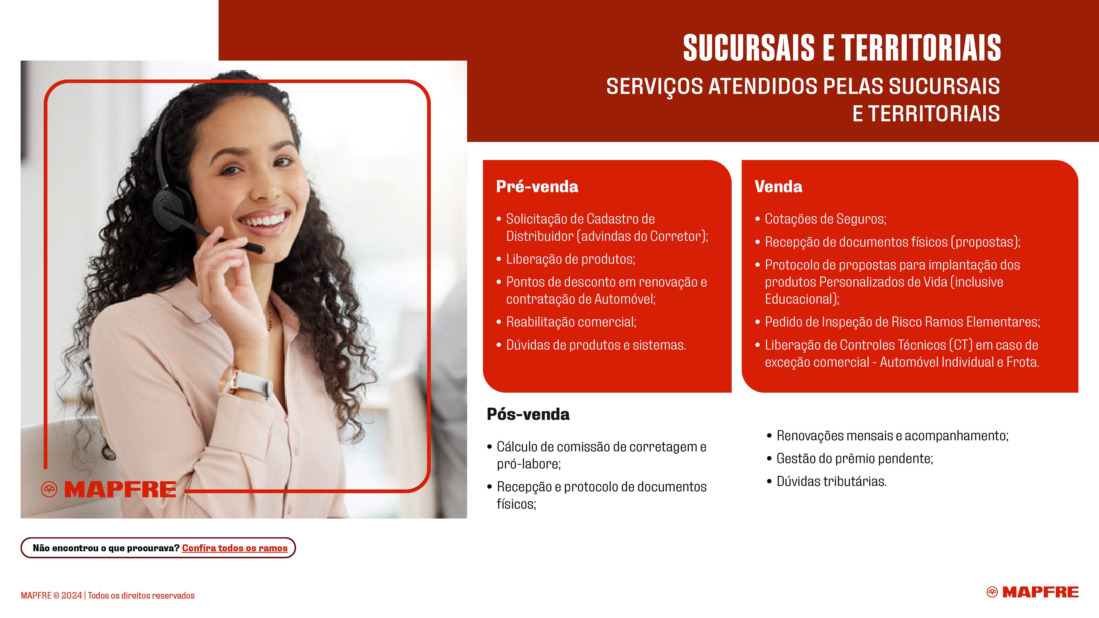
CNO Catalog: Redesigned based on three strategic pillars, creating an organized layout that supports brokers during client prospection while maintaining original content integrity.
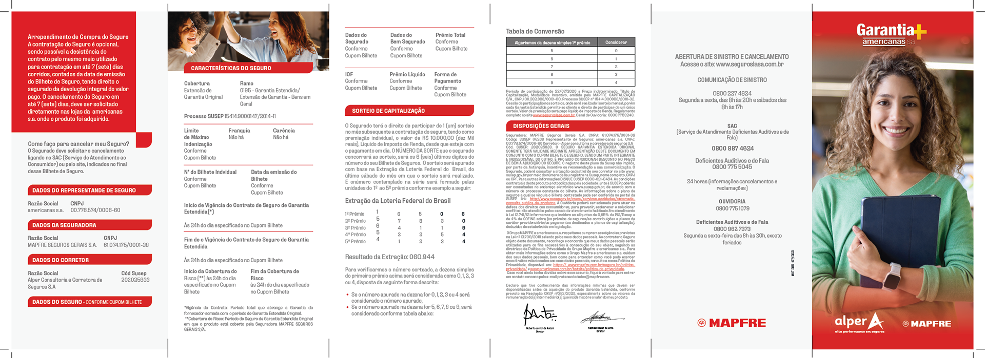
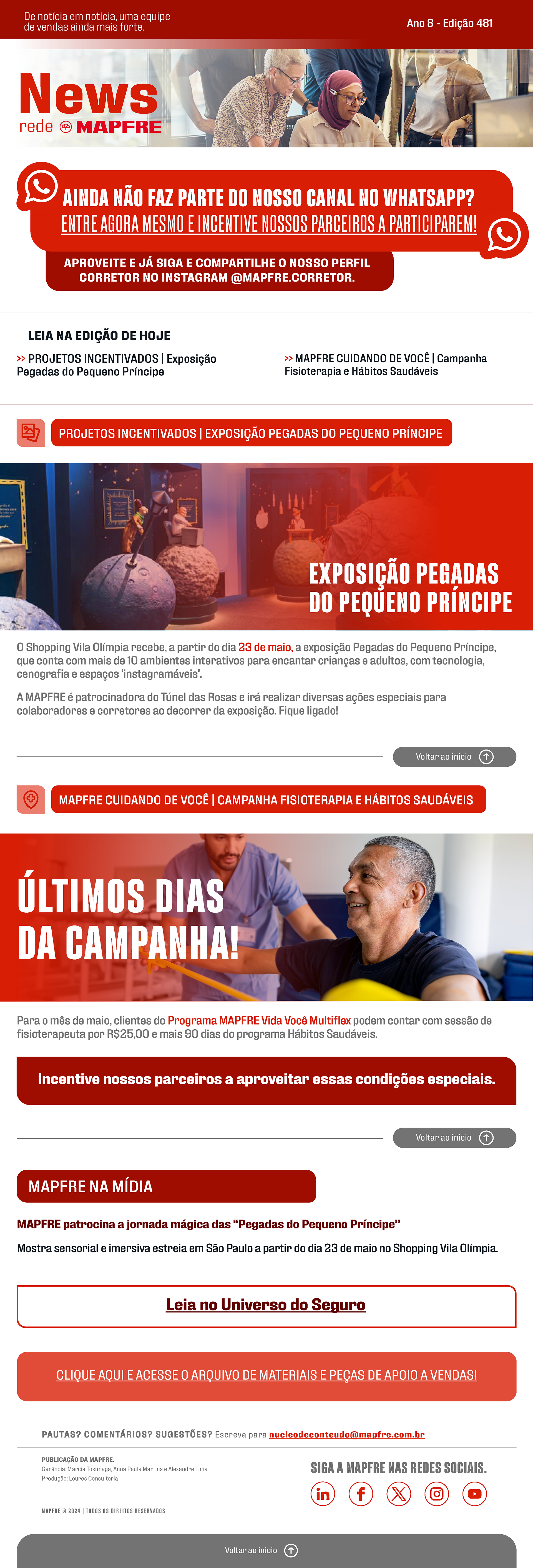
Printed Folders: Developed to reinforce the overall strategy, ensuring a unified brand voice across all physical touchpoints.
CNO Catalog: Redesigned based on three strategic pillars, creating an organized layout that supports brokers during client prospection while maintaining original content integrity.
Printed Folders: Developed to reinforce the overall strategy, ensuring a unified brand voice across all physical touchpoints.
Design Strategy
Working closely with the internal team, I established a visual identity centered on three core pillars:
More People: Reflecting MAPFRE’s focus on human connection to make brokers feel like an integral part of the brand.
Modernity with Heritage: Adopting a contemporary visual language that respects the company’s traditional credibility.
Clarity Above All: Combining clean typography with people-focused imagery for direct and effective communication.
Modernity with Heritage: Adopting a contemporary visual language that respects the company’s traditional credibility.
Clarity Above All: Combining clean typography with people-focused imagery for direct and effective communication.

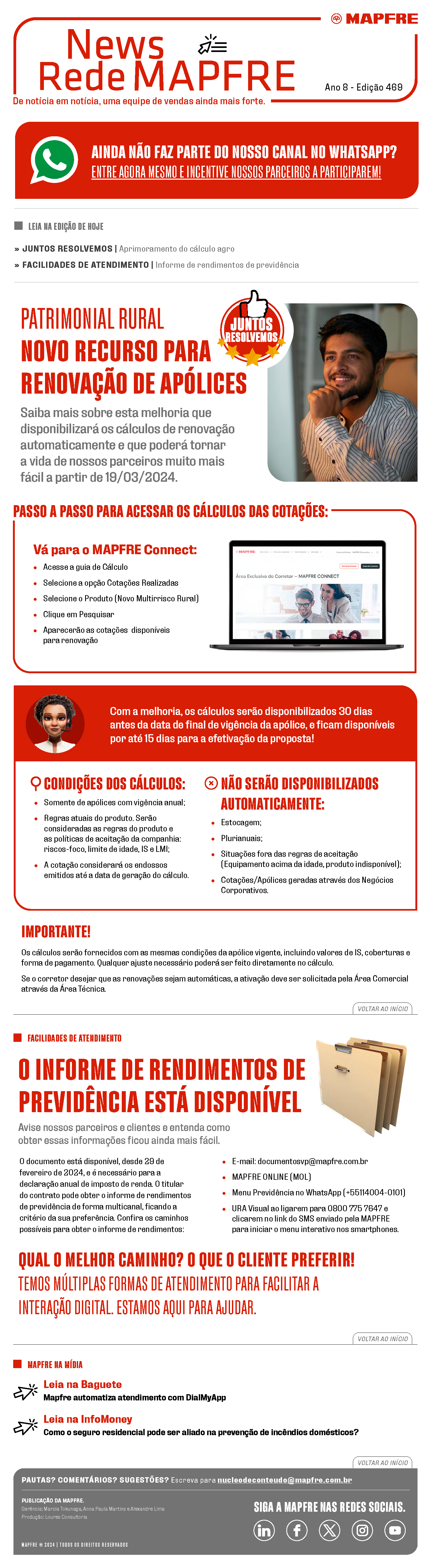
The layout was developed based on the three pillars, with a flexible and adaptable design system that could accommodate different types of content within the newsletter.
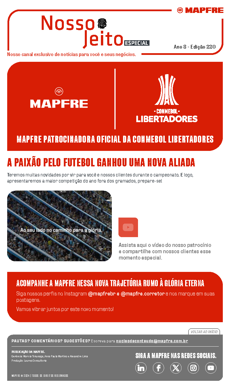
For example, the first image below addresses a sensitive topic — the climate events in Rio Grande do Sul, Brazil. In this case, the team intentionally avoided using imagery and instead applied a single, solid color in the header to convey respect and maintain an appropriate tone.

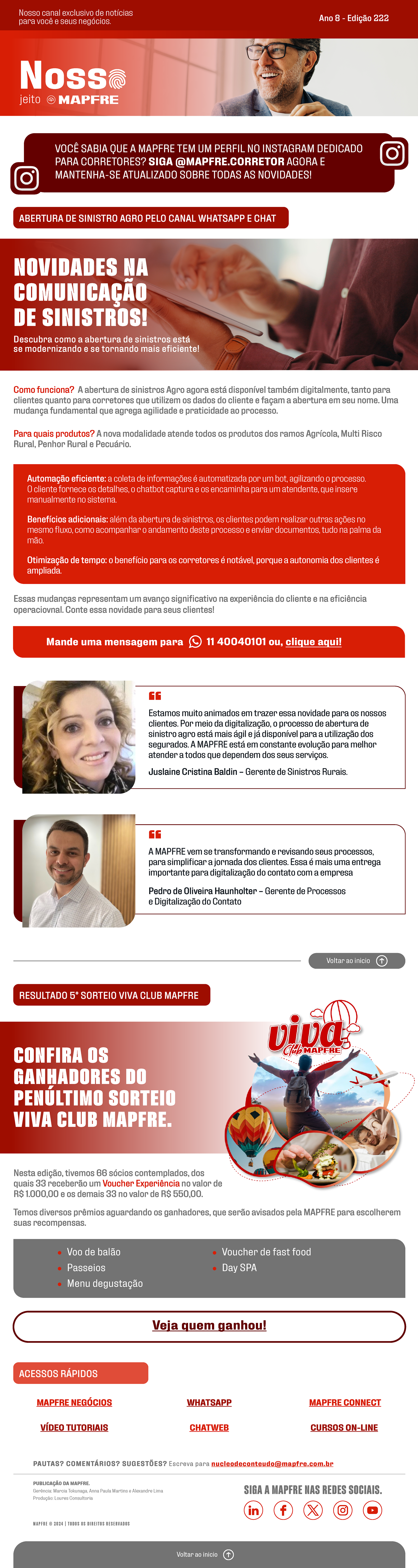
• For the catalog, I worked closely with the internal communication team to redesign the material based on the three previously defined pillars. Through strong graphic design principles, we created a more organized and structured layout while preserving the original content. Below, you can see before-and-after examples of selected catalog pages.


• Two printed folders were created to complete and finalize the overall communication strategy. These materials followed the same three design pillars and were distributed to employees, ensuring visual consistency across all touchpoints.