MAPFRE
GRAPHIC DESIGN | PRINT | INTERNAL COMMUNICATION
MAPFRE internal communication were in a challenging moment with their communication with their commercial insurance brokers. The three materials that I work with were:
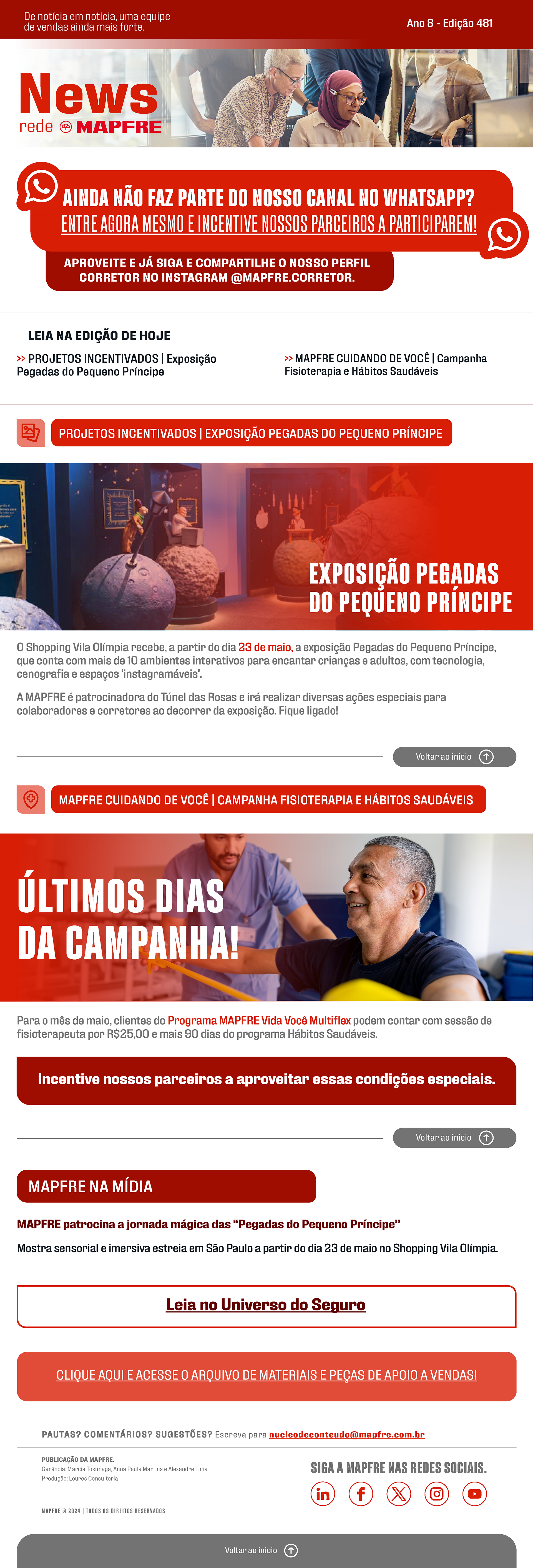
• The newsletter wasn't having a good performance, they also needed a new , people weren't reading in and in an analysis with the internal communication team we worked on a visual solution to captivate the attention of the people.
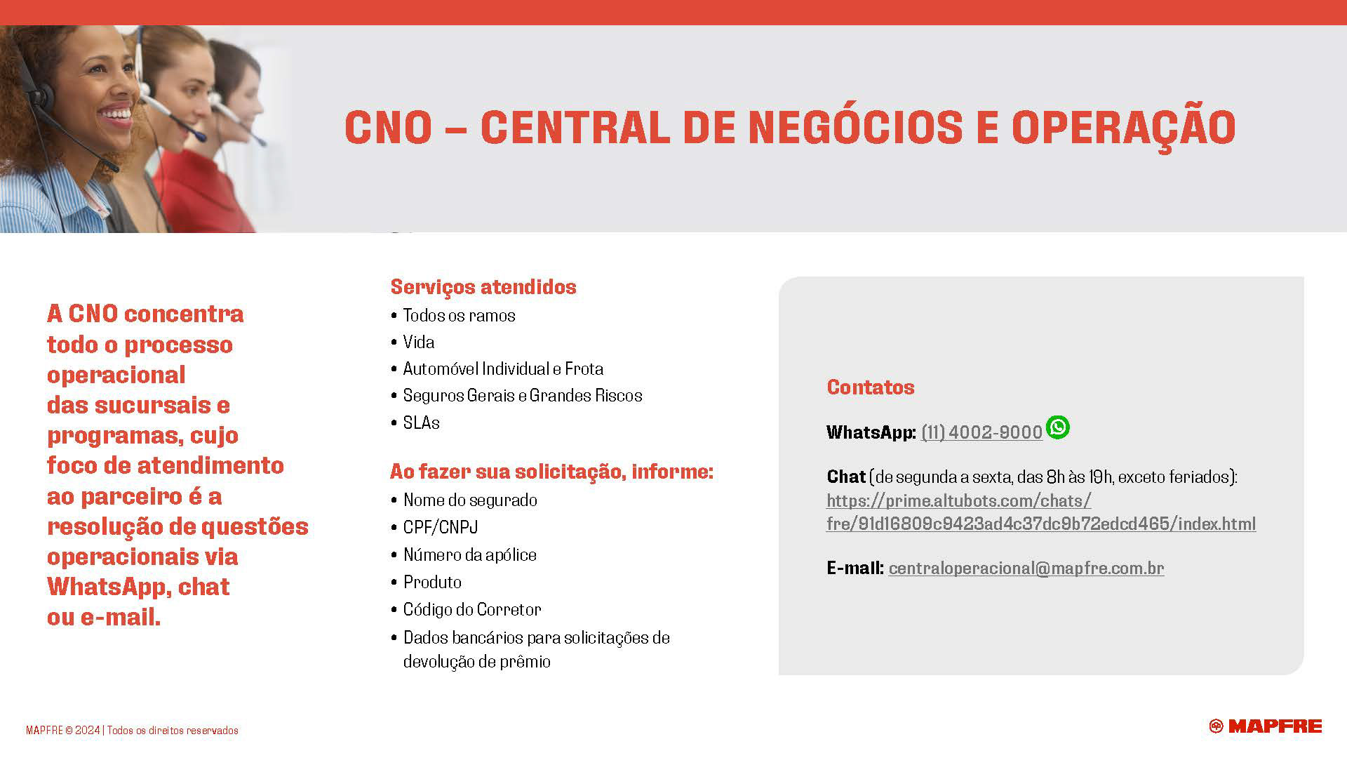
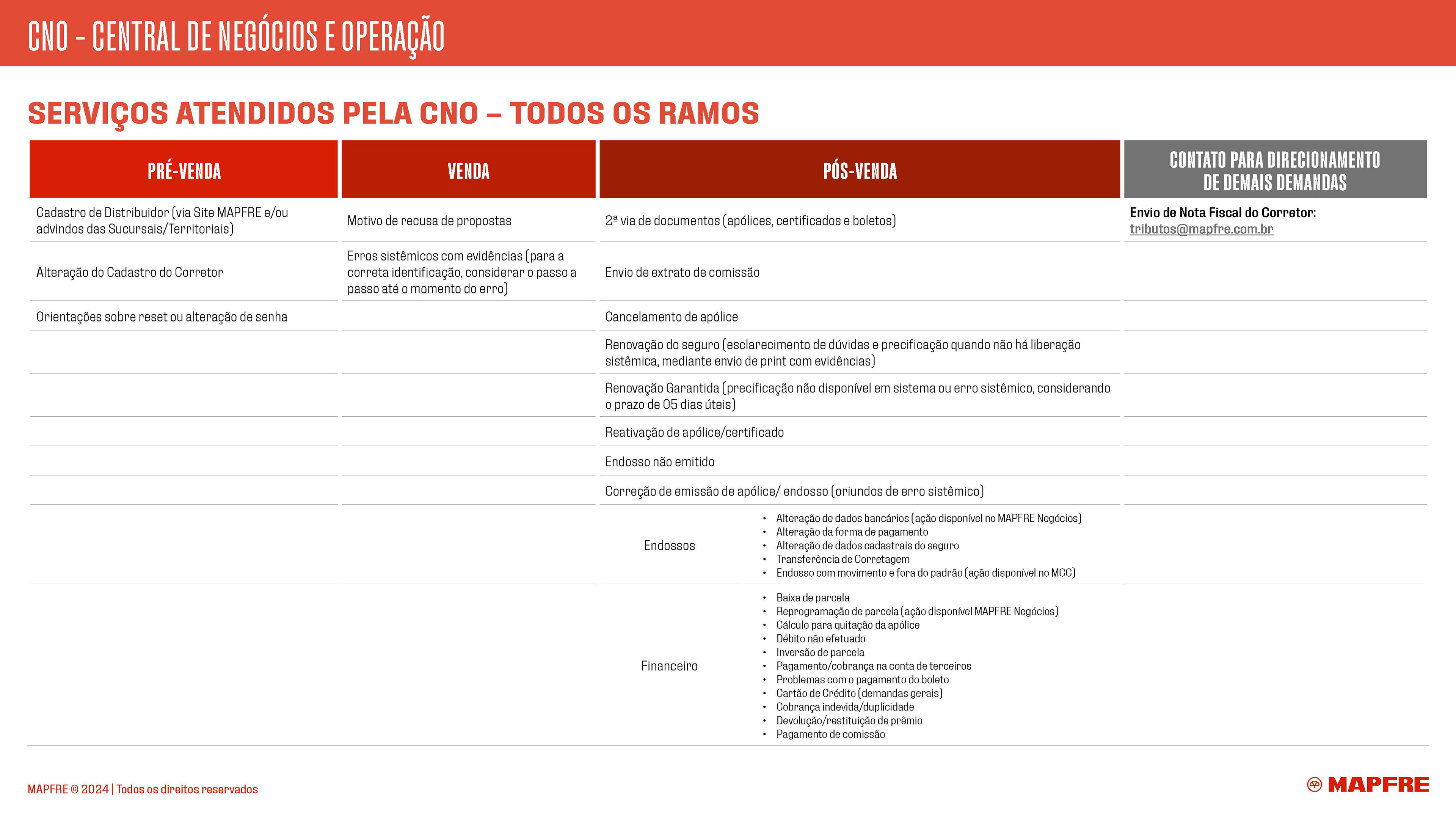
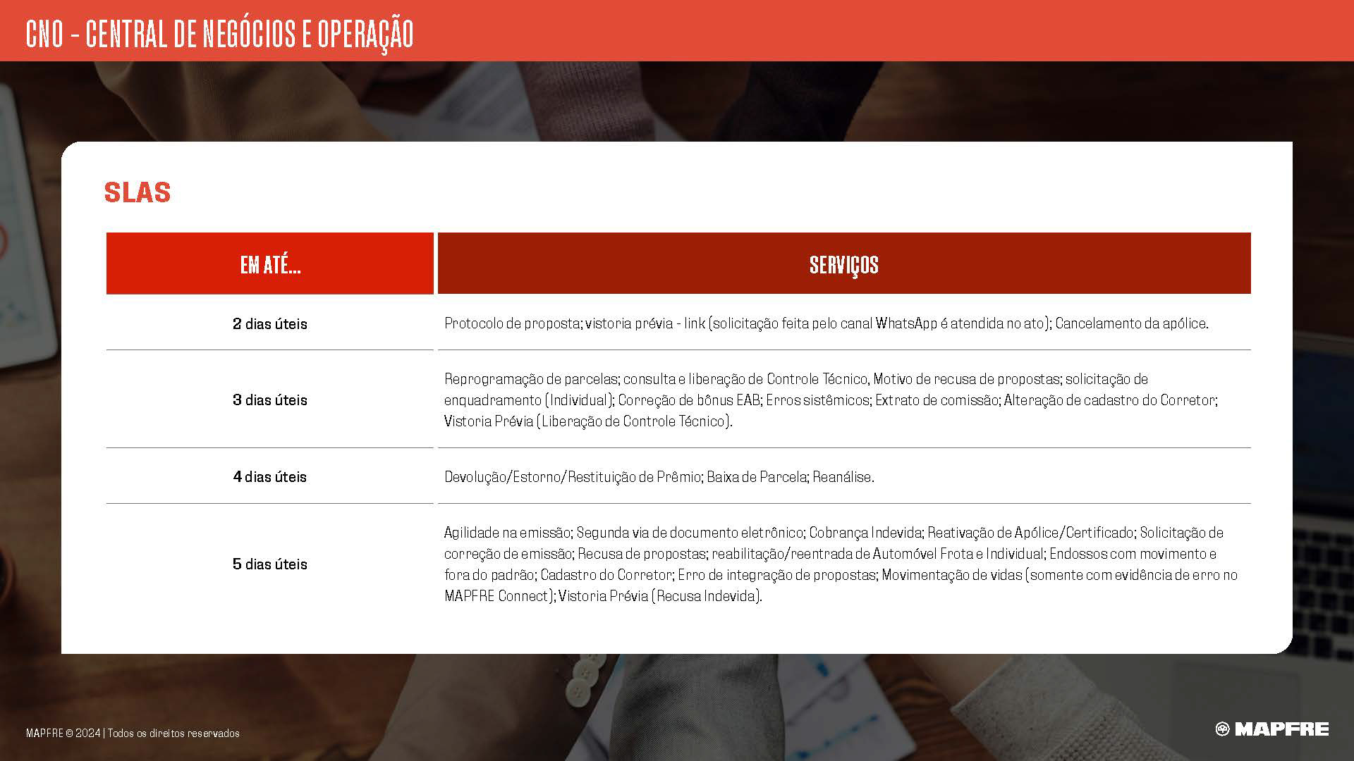
• A catalog called "CNO" needed a new modern and clean layout, this material were an important asset to their insurance brokers clients prospects.
• Two printed foldering to compose and finish the whole communication.
• The newsletter wasn't having a good performance, they also needed a new , people weren't reading in and in an analysis with the internal communication team we worked on a visual solution to captivate the attention of the people.
• A catalog called "CNO" needed a new modern and clean layout, this material were an important asset to their insurance brokers clients prospects.
• Two printed foldering to compose and finish the whole communication.
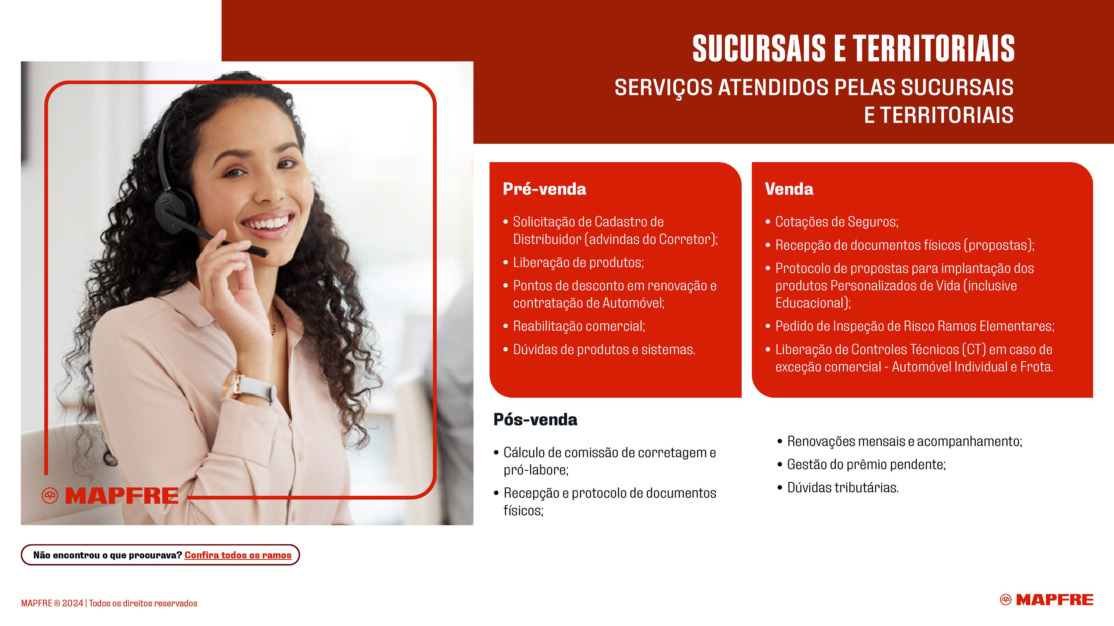
To constructed a new strategic layout I worked with the internal communication team and we bringing a new visual identity based in 3 pillars:
More people - MAPFRE is a company that cares, so communication needs to show this to insurance brokers, and make them feel this important asset of the brand;
More modernity (but without losing the classic way of communicating) - As a company that has been around for years, MAPFRE wanted to present a modern layout, but without losing the old information structure;
Clearer information - Using a combination of clear typography and photos of people, my goal was to inform people as clearly as possible.
Starting with the old newsletters layout from MAPFRE, which were compose with too much text occasioning people giving up reading
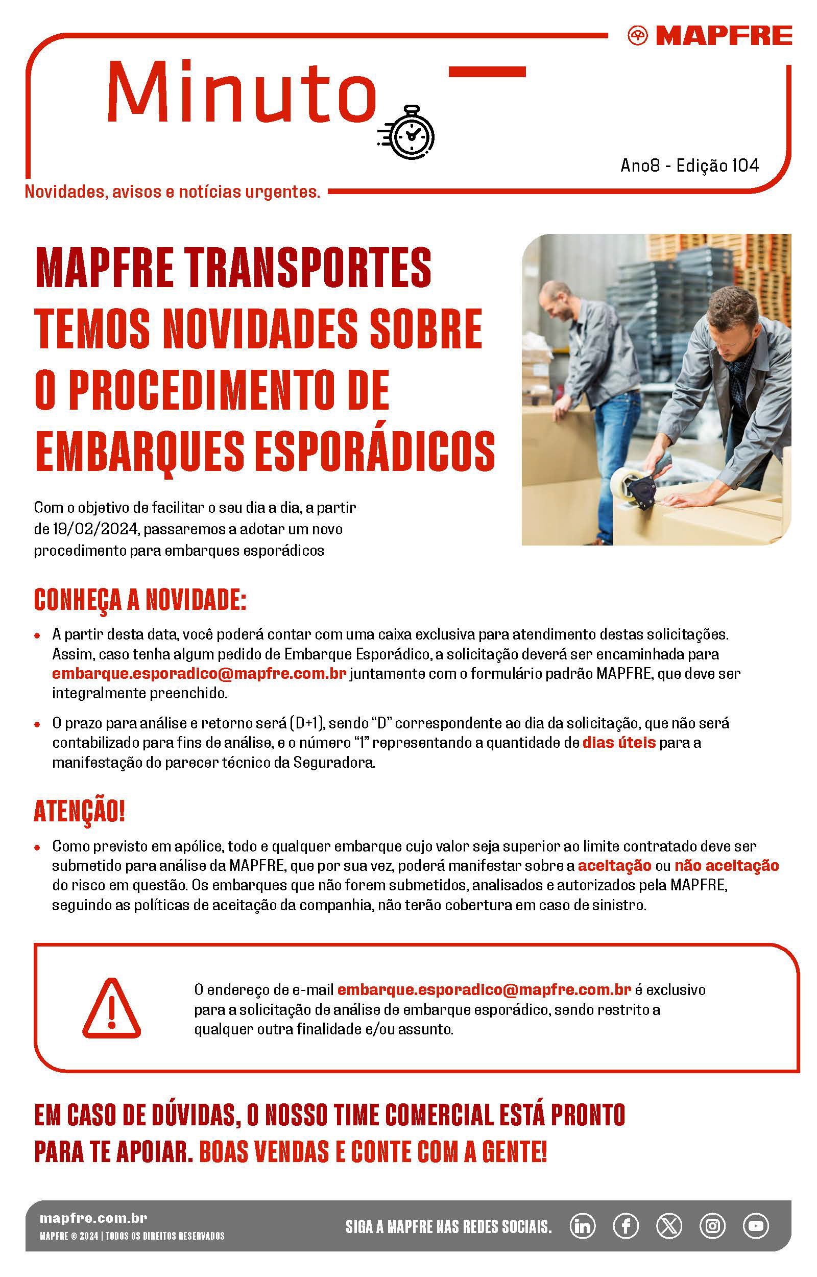
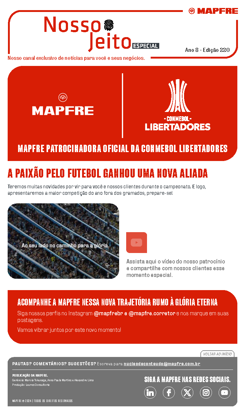
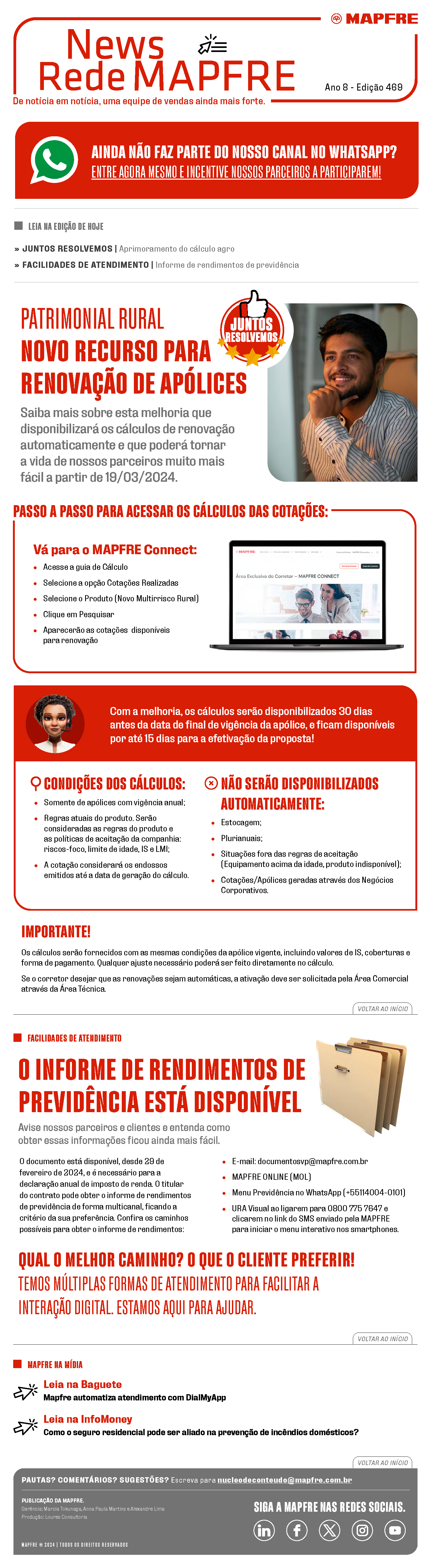
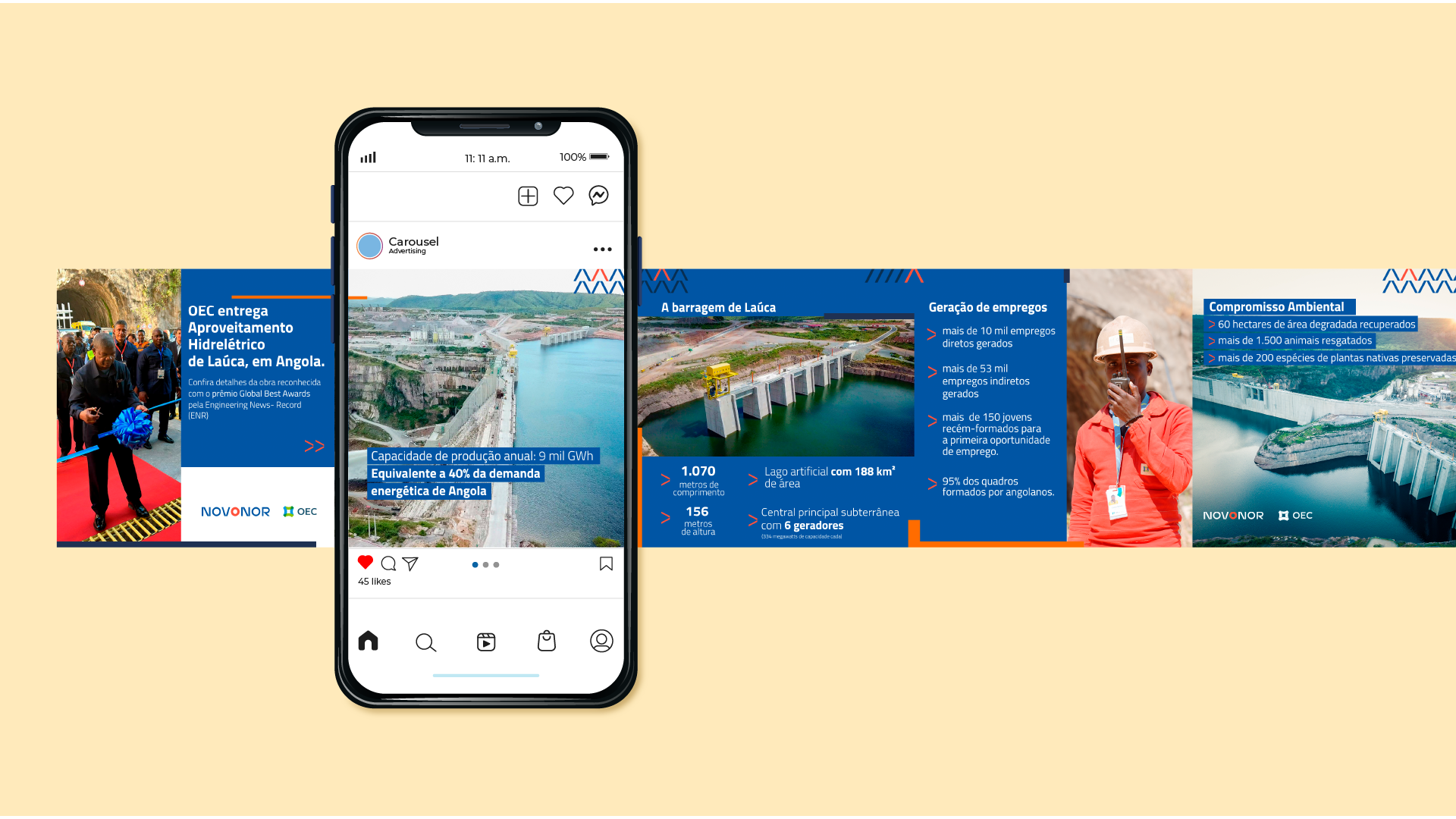
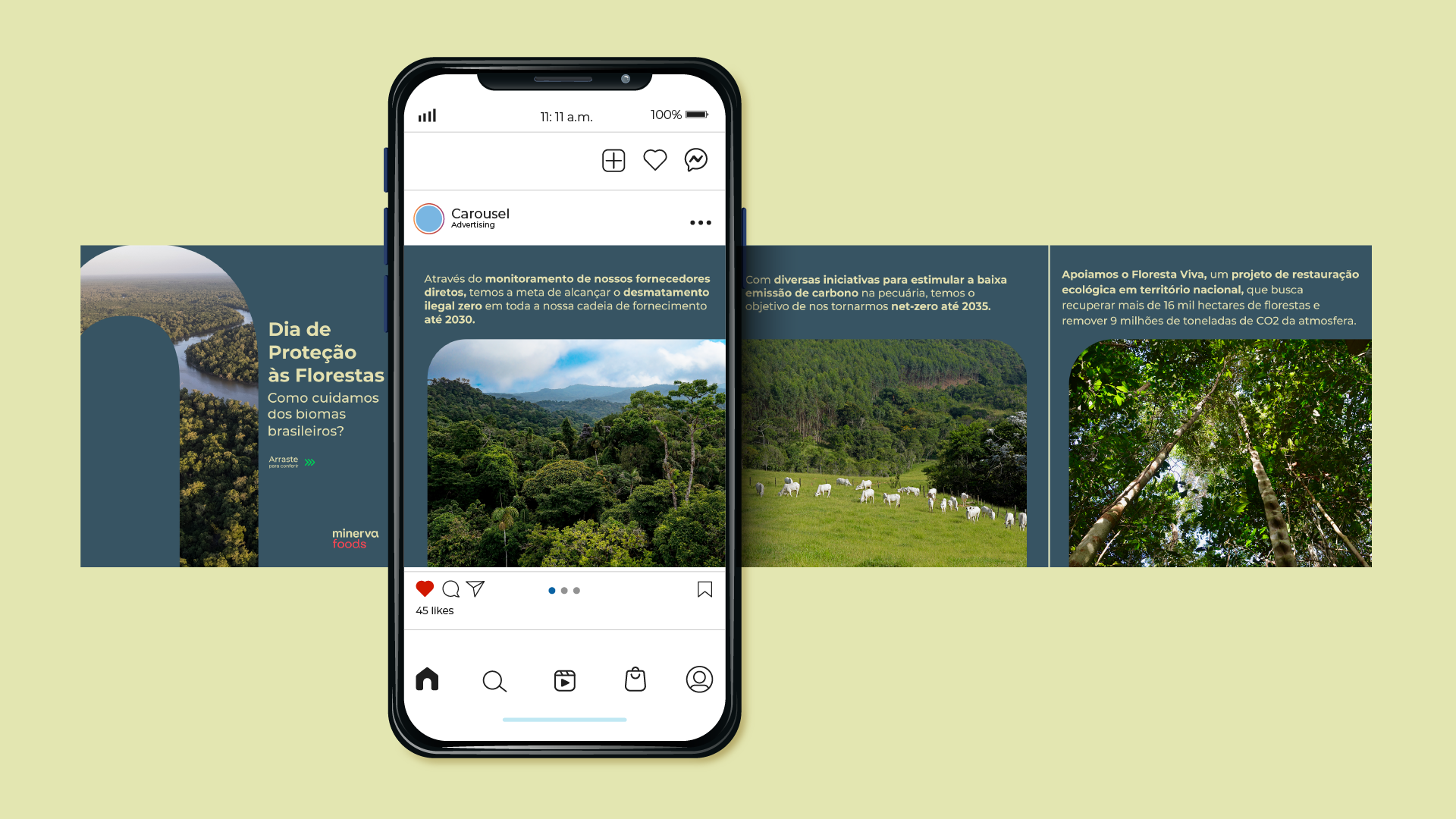
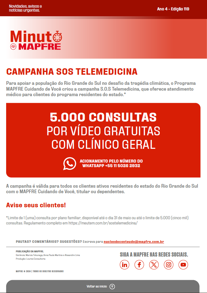
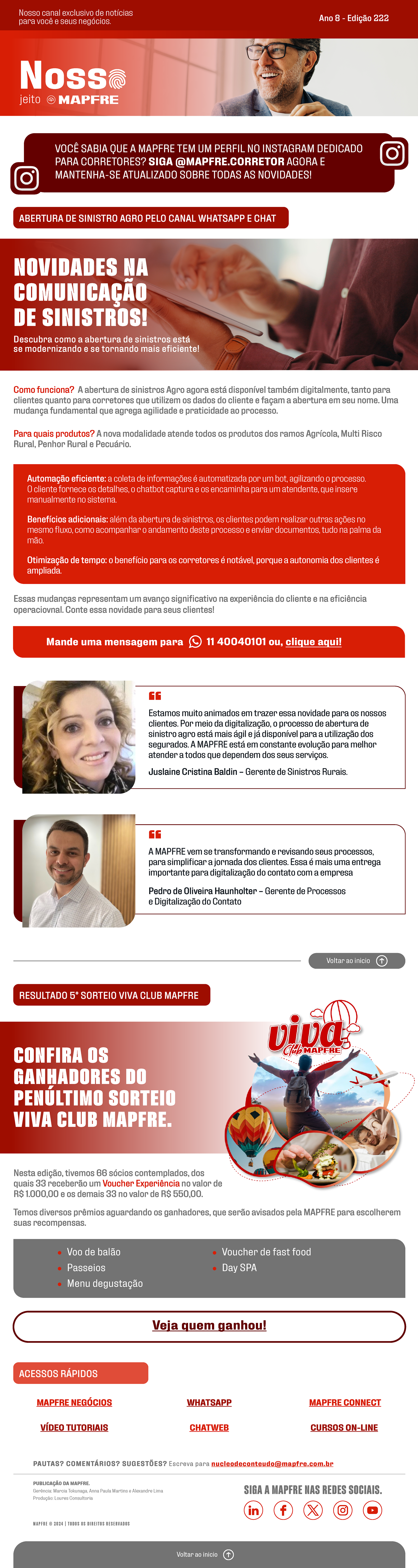
Below you can see the results. I worked on a layout based on the 3 pillars, but thinking about an adaptable design to work with the different types of subjects presented in the newsletter. For example: the first image below is a communication about a delicate subject, the climate events in Rio Grande do Sul - Brazil, so the team chose not to use an image to represent this moment, working only with one color in the header.
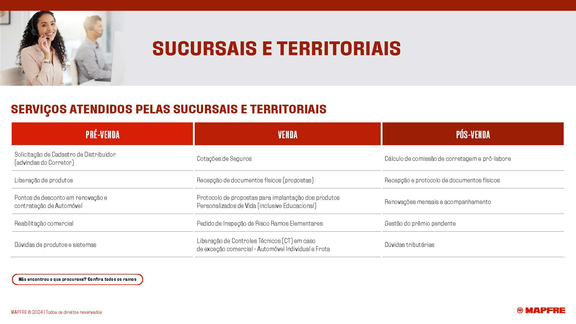
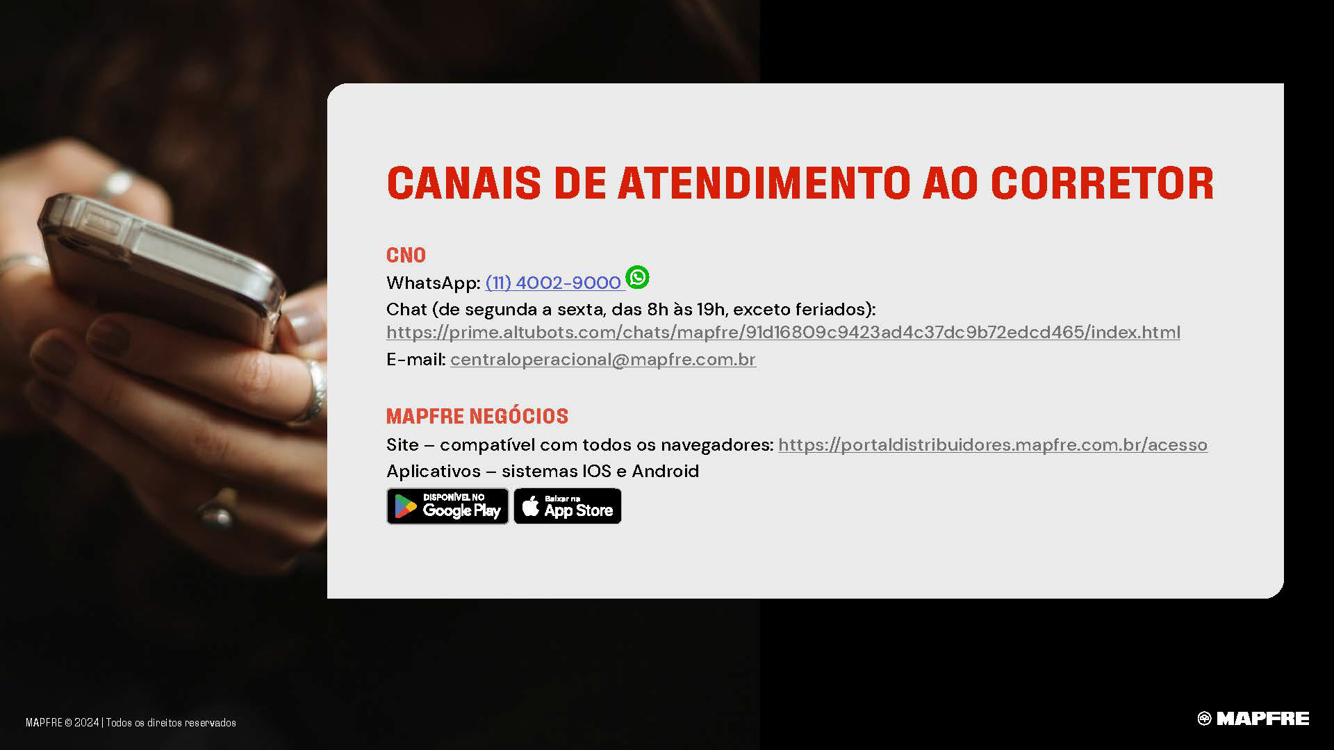
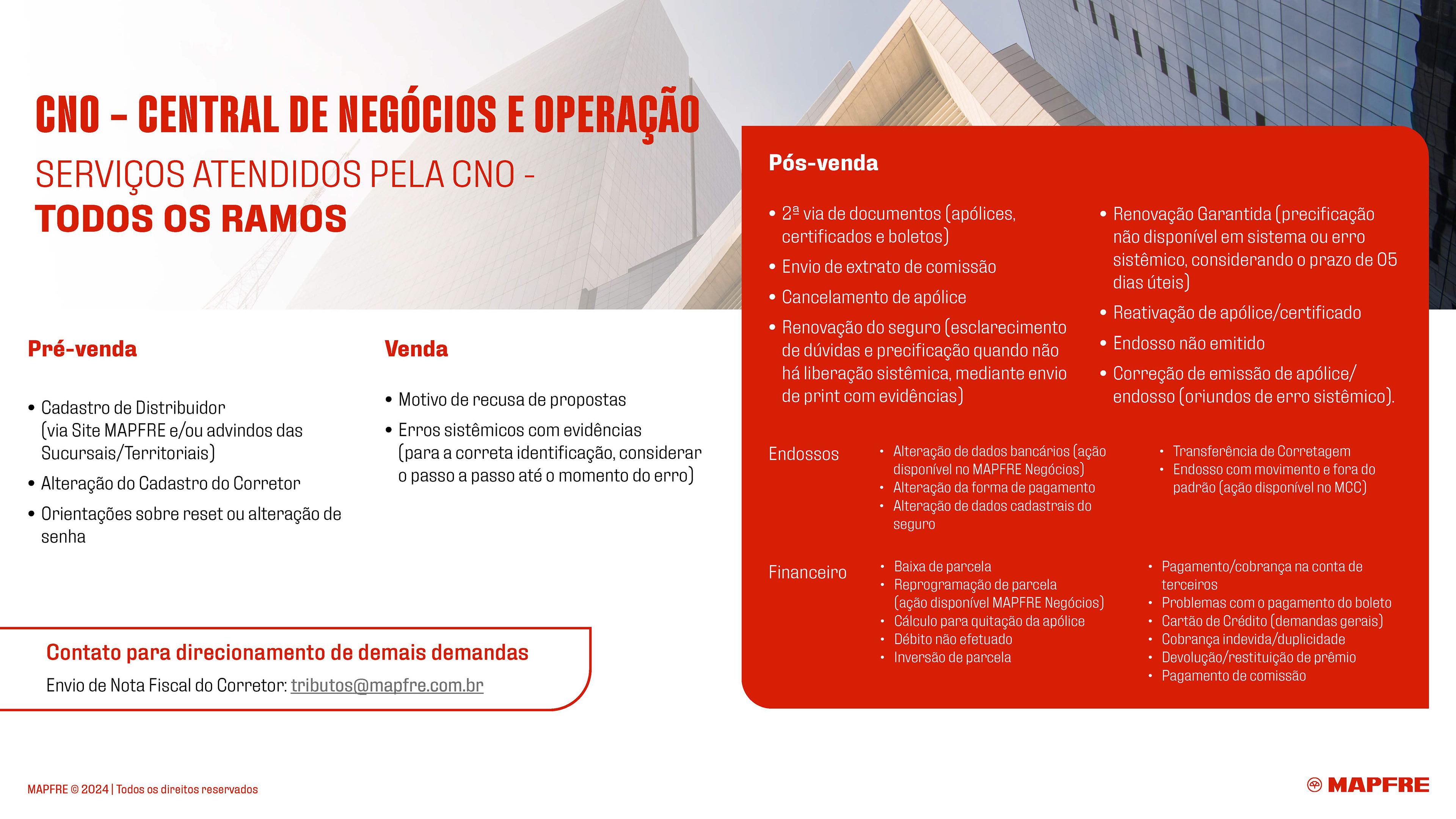
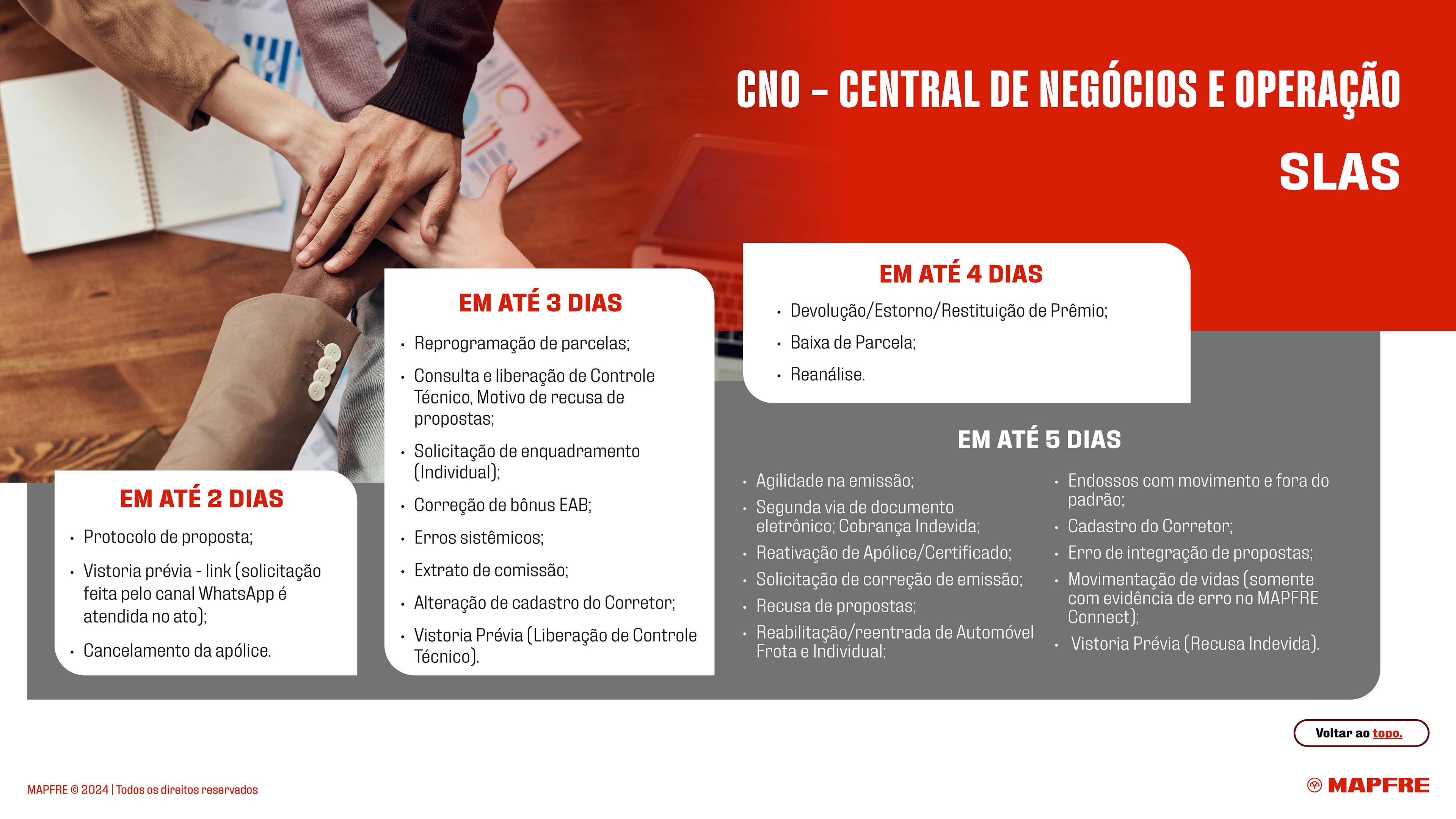
• For the catalog I worked with the internal communication team to reconstruct a material based on the 3 pillars that were previously defined. Using good graphic design we contruct an organized design keeping the same informations, below you can check the before and after of some pages of the catalog.


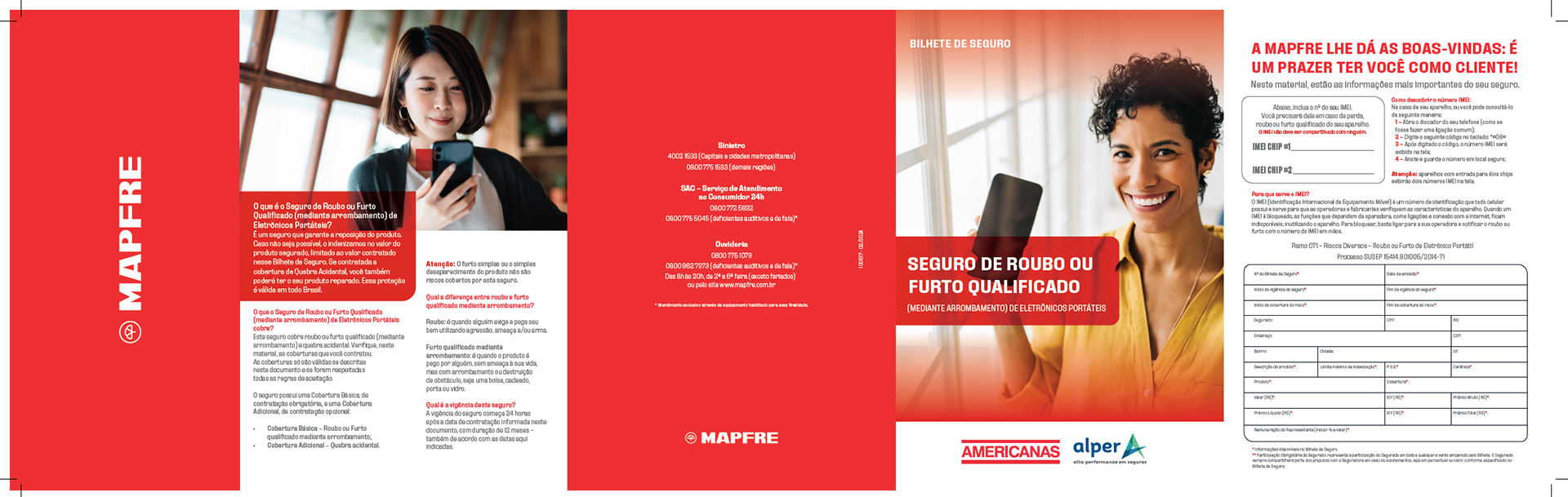
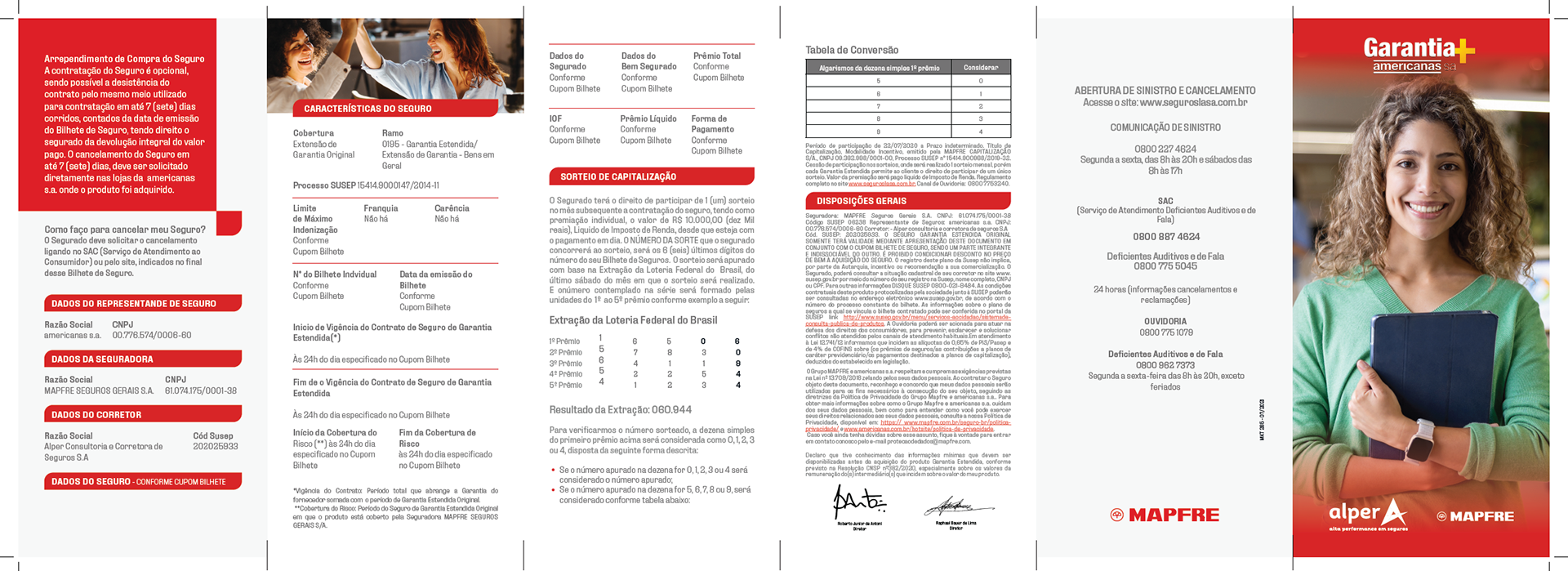
• Two printed folders were created to complete and finalize the entire communication. The materials were compiled using the same three pillars and distributed to employees.